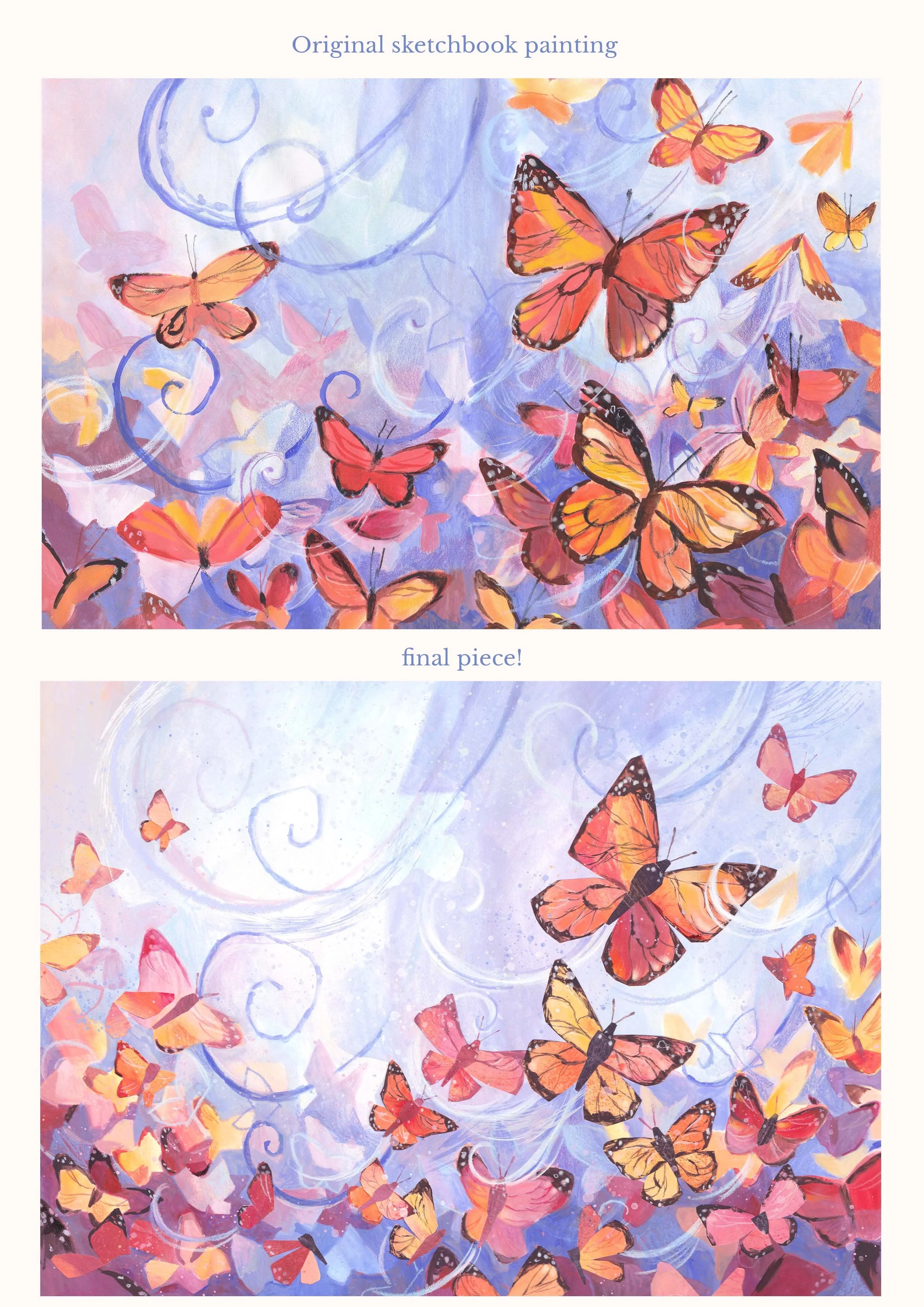
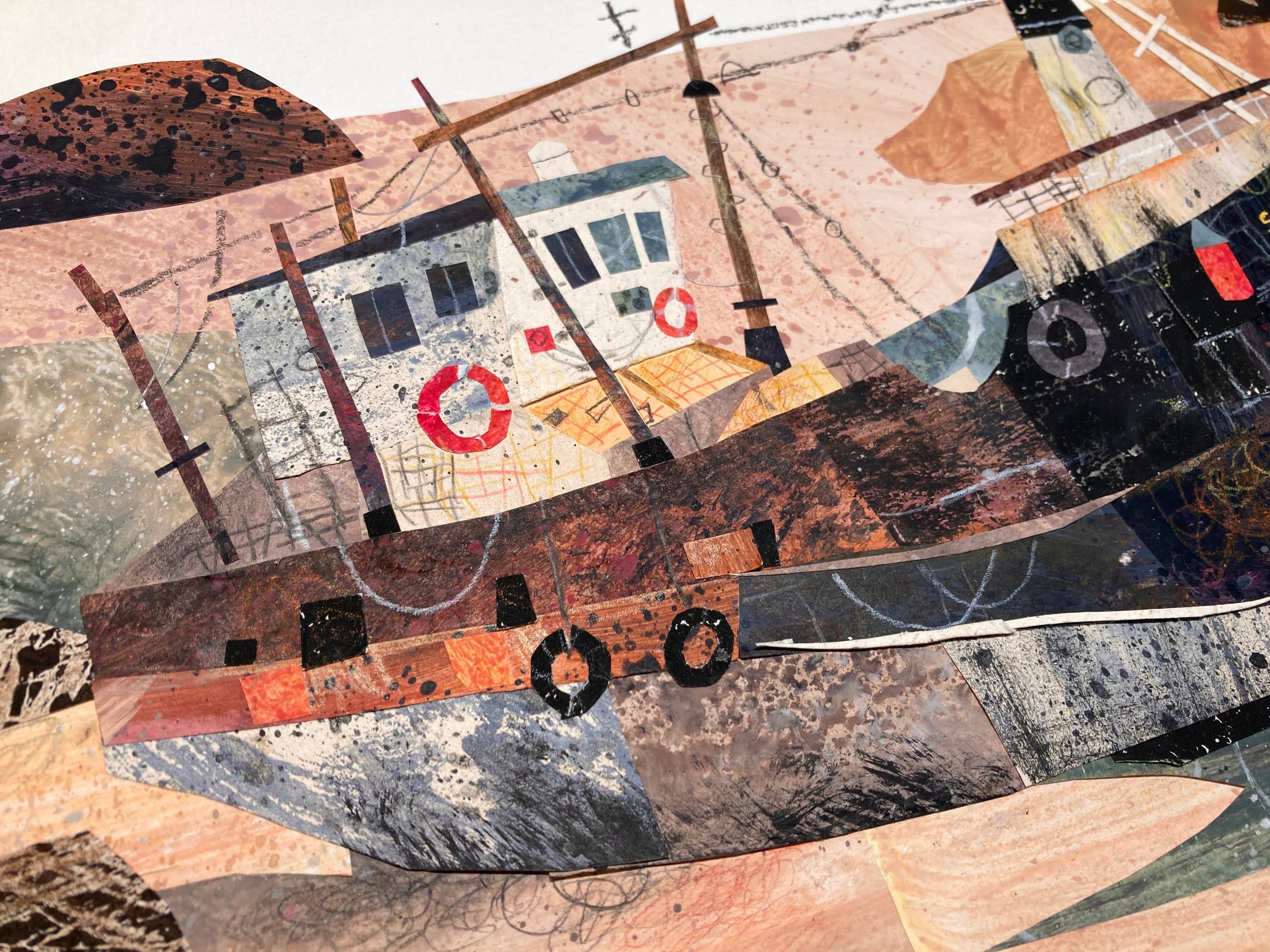
This could be my favourite piece of art I’ve made all year! For a while I’ve been trying to combine a loose painting style with my usual collage style and I feel with this piece, I’ve finally cracked the code. I’ve had attempts in the past where the collage feels like it’s been shoe horned in at the end and it doesn’t quite look right, but with each failed attempt, as horrible as it feels in the moment, it’s one step closer to solving the puzzle! I sometimes think, art would be so much easier if I just stuck to one media, as it takes away a big chunk of the decision making. No more staring at a plan and spending way to much time debating which sections will be done in what media. But the heart wants what the heart wants… and mine just loves the look of a mixed media illustration!
So how did this piece come about? First off, it was October and I don’t need any encouragement to use an autumnal pallet, but mainly, I needed to make my Patreon monthly printable. I had recently seen a beautiful witch illustration (in the mood board below) by Ema Malyauka, which I used as the starting point for my inspiration. After a good scroll through pinterest, I had come up with this mood board. One of my favourite shows as a kid was ‘Fosters Home for Imaginary Friends’ ,which was set in this huge higgldy piggldy colourful house. After a bit of thinking, the Idea poped into my head to make a halloween decoration with kids walking up to a big haunted house, so let the planning begin.
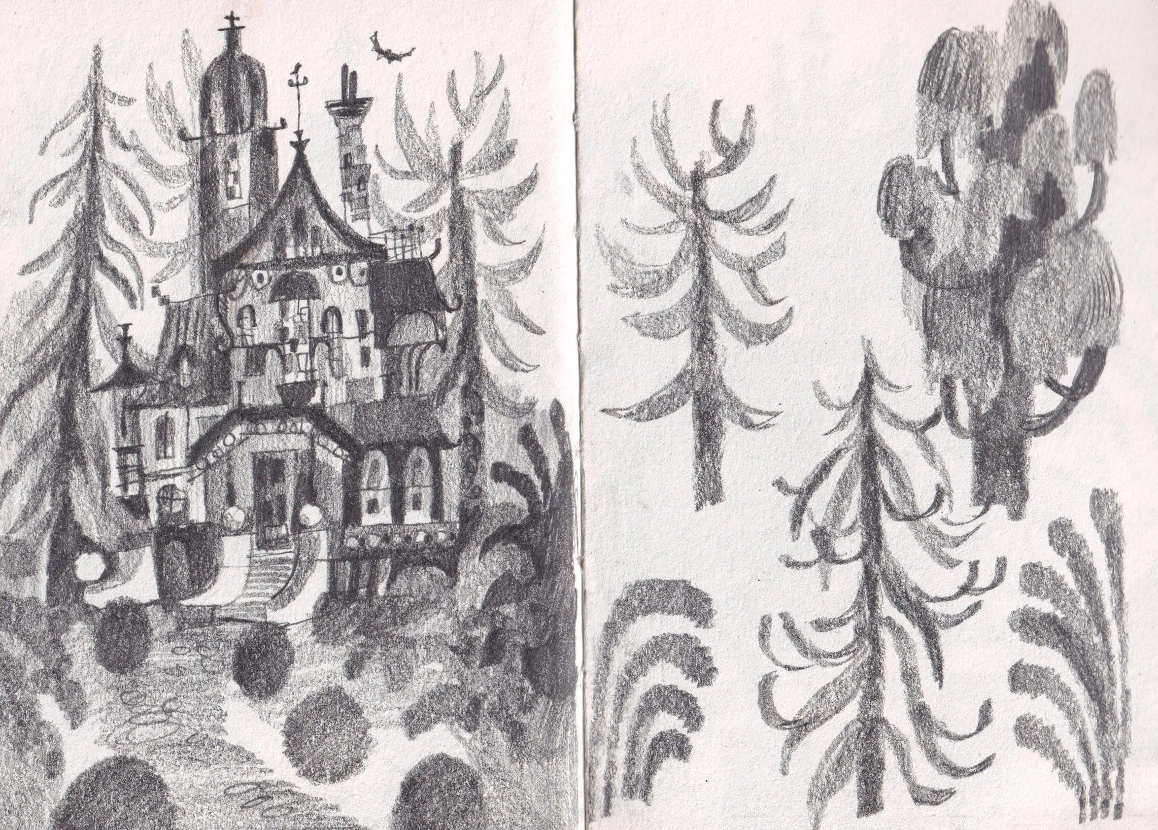
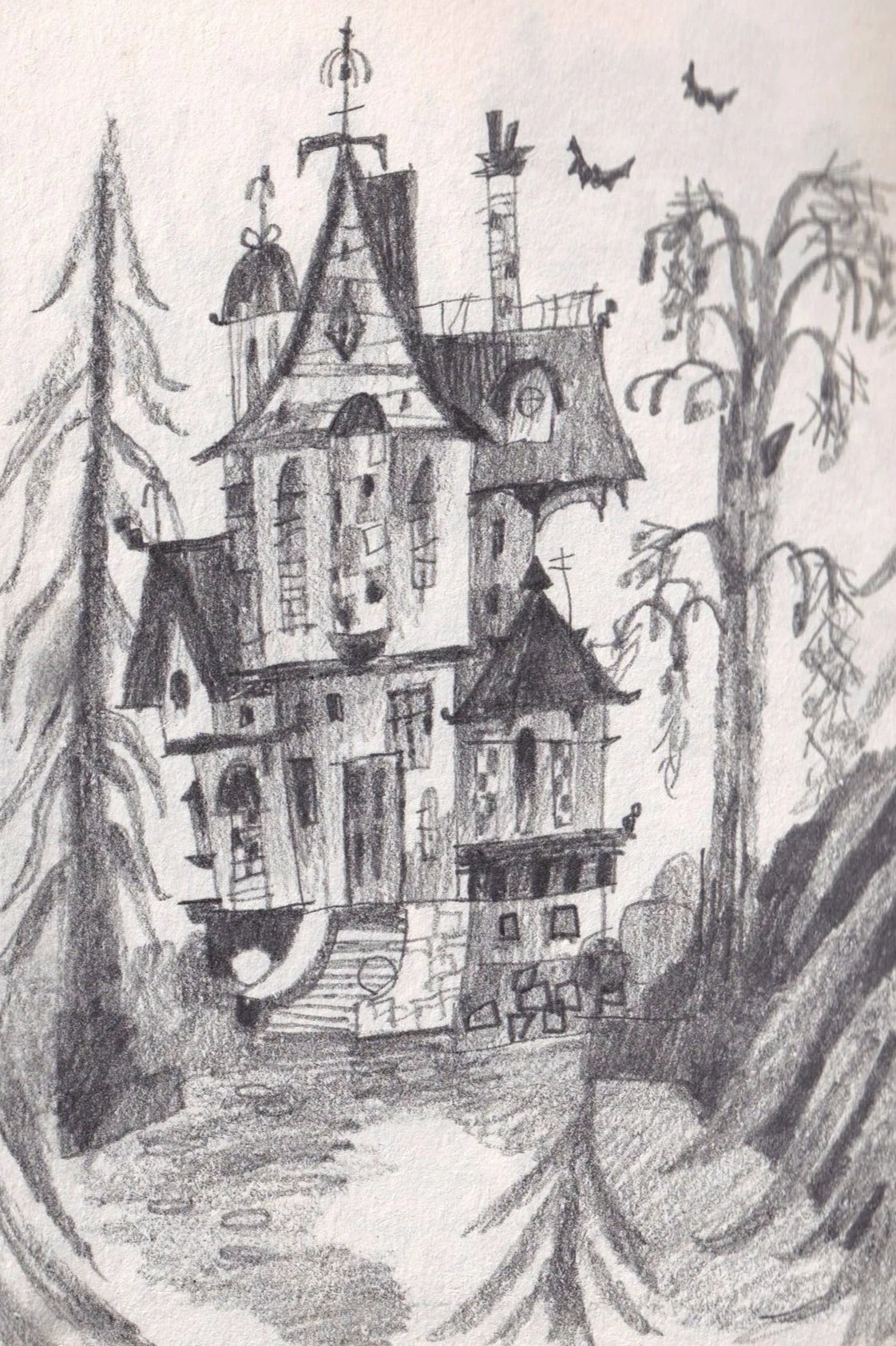
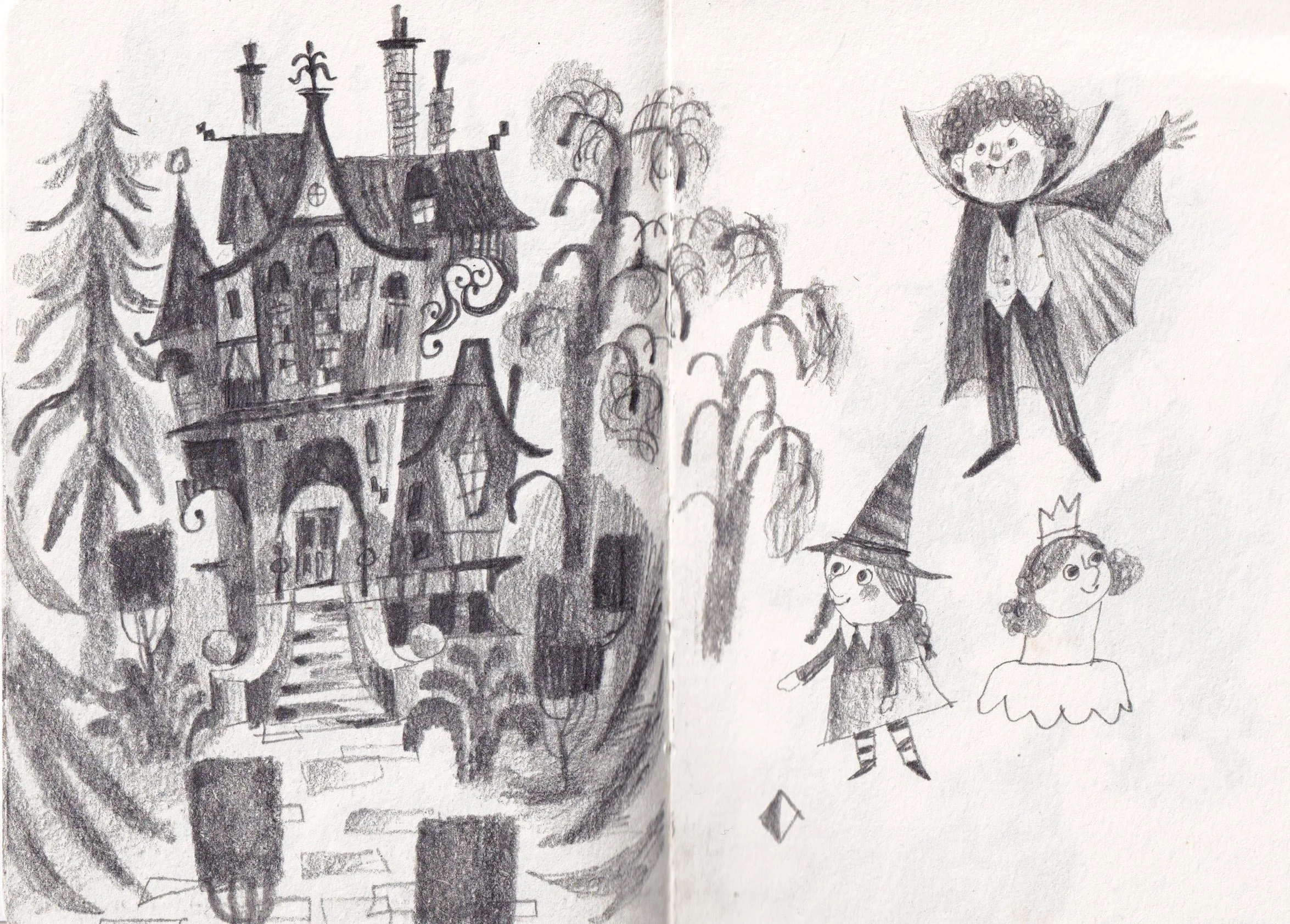
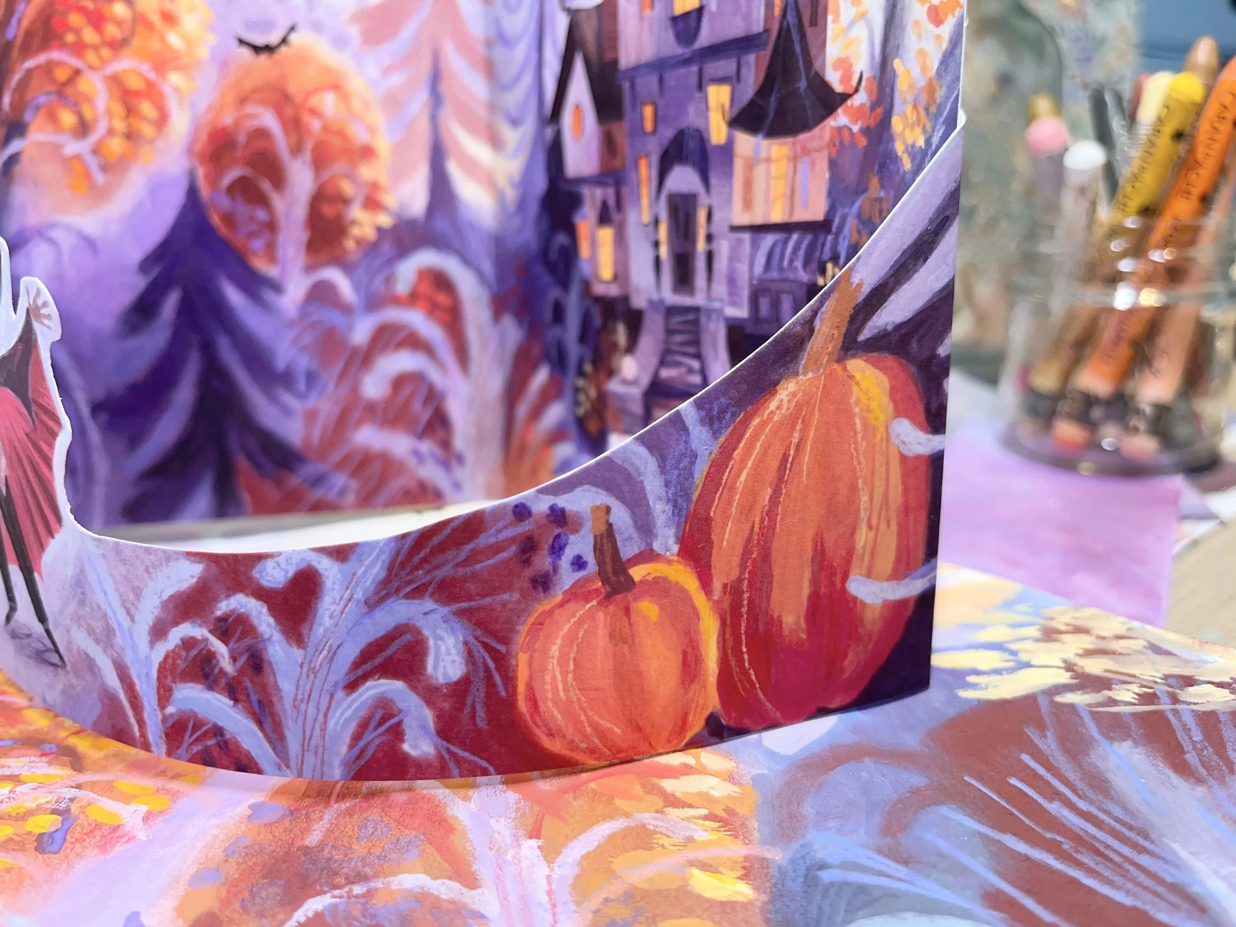
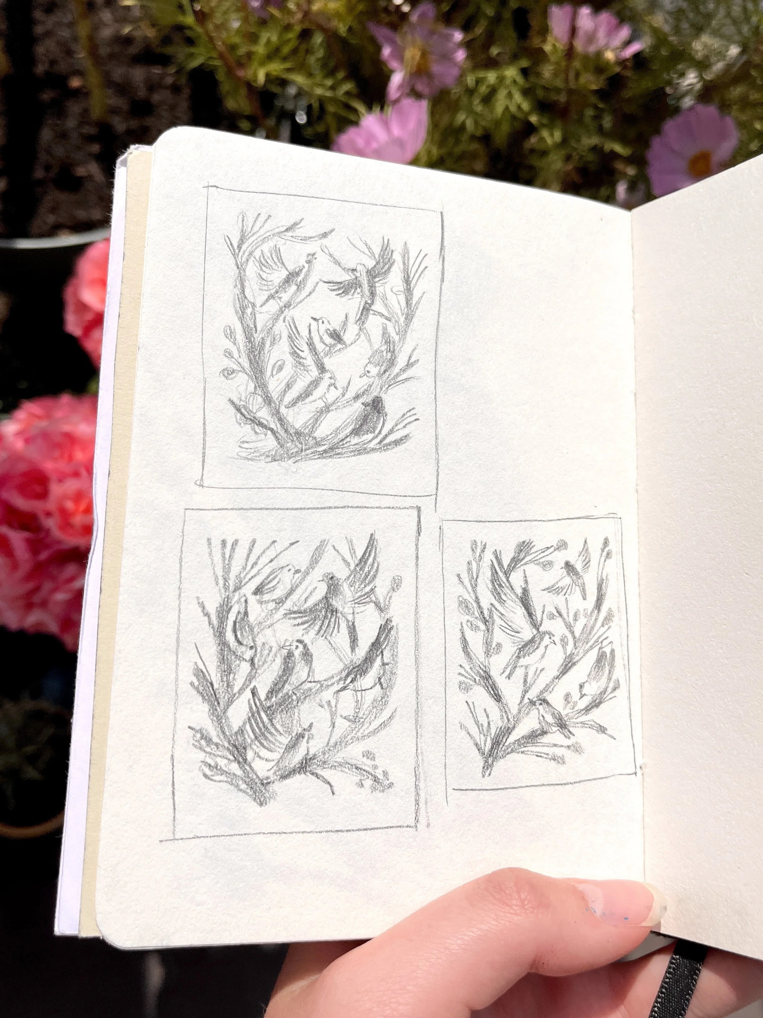
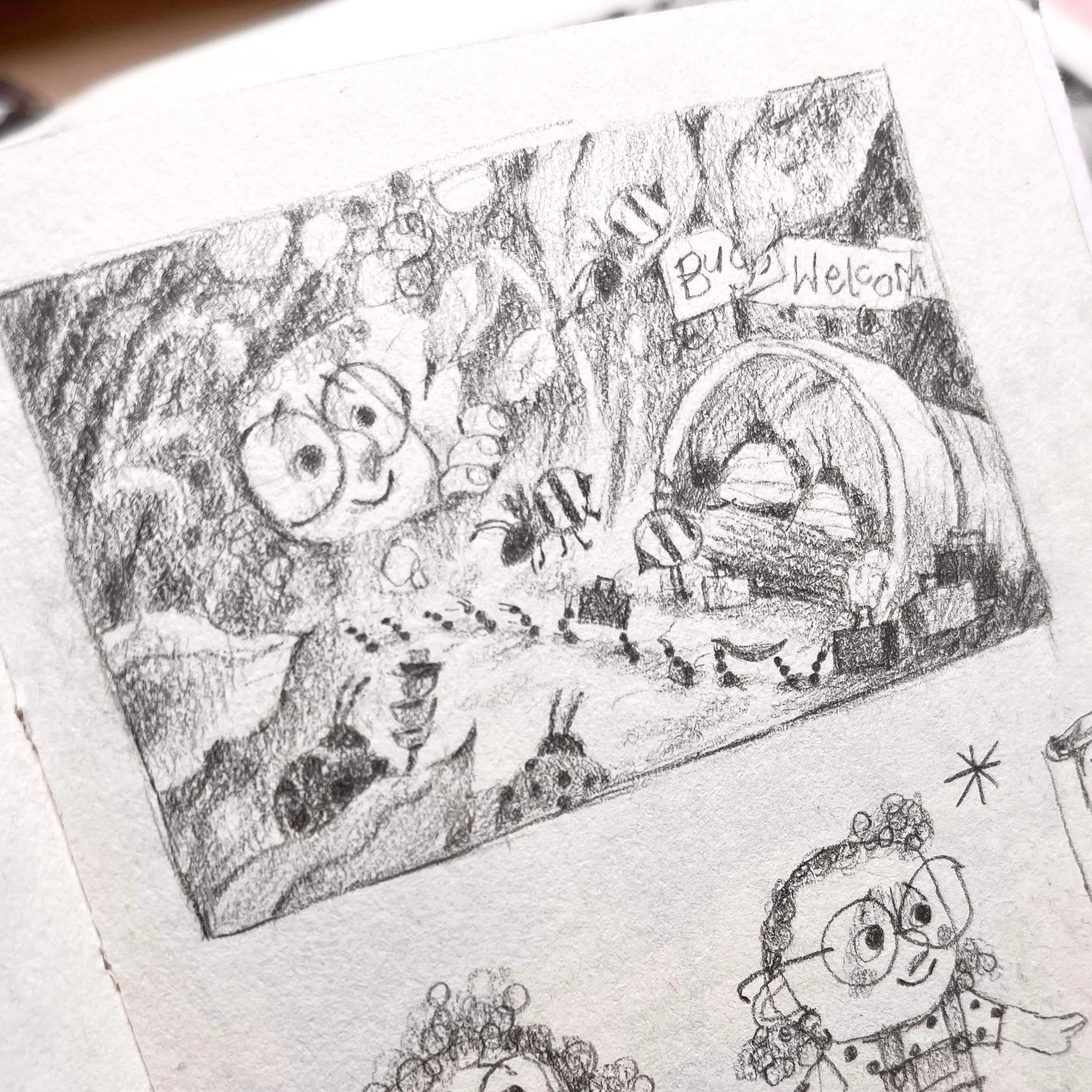
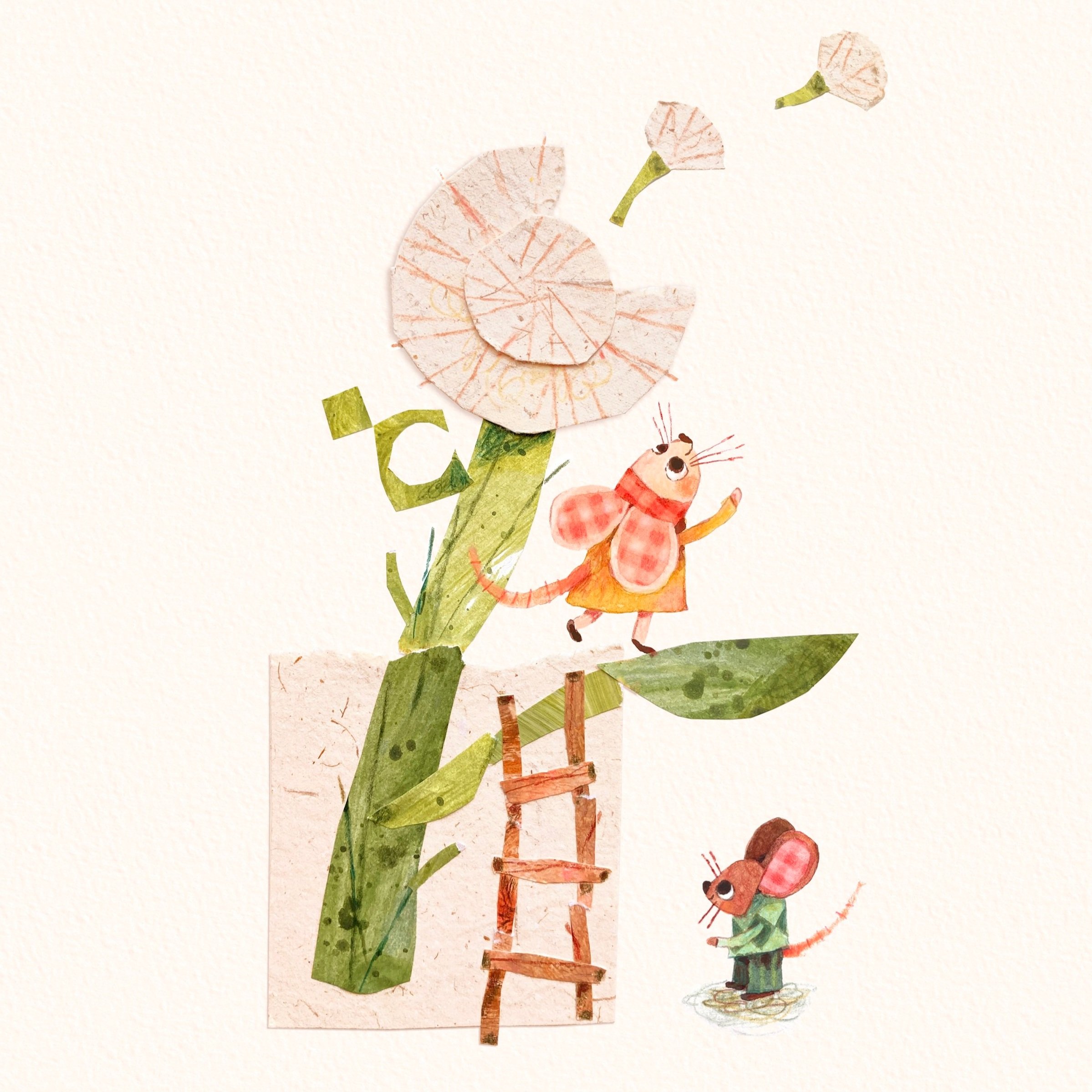
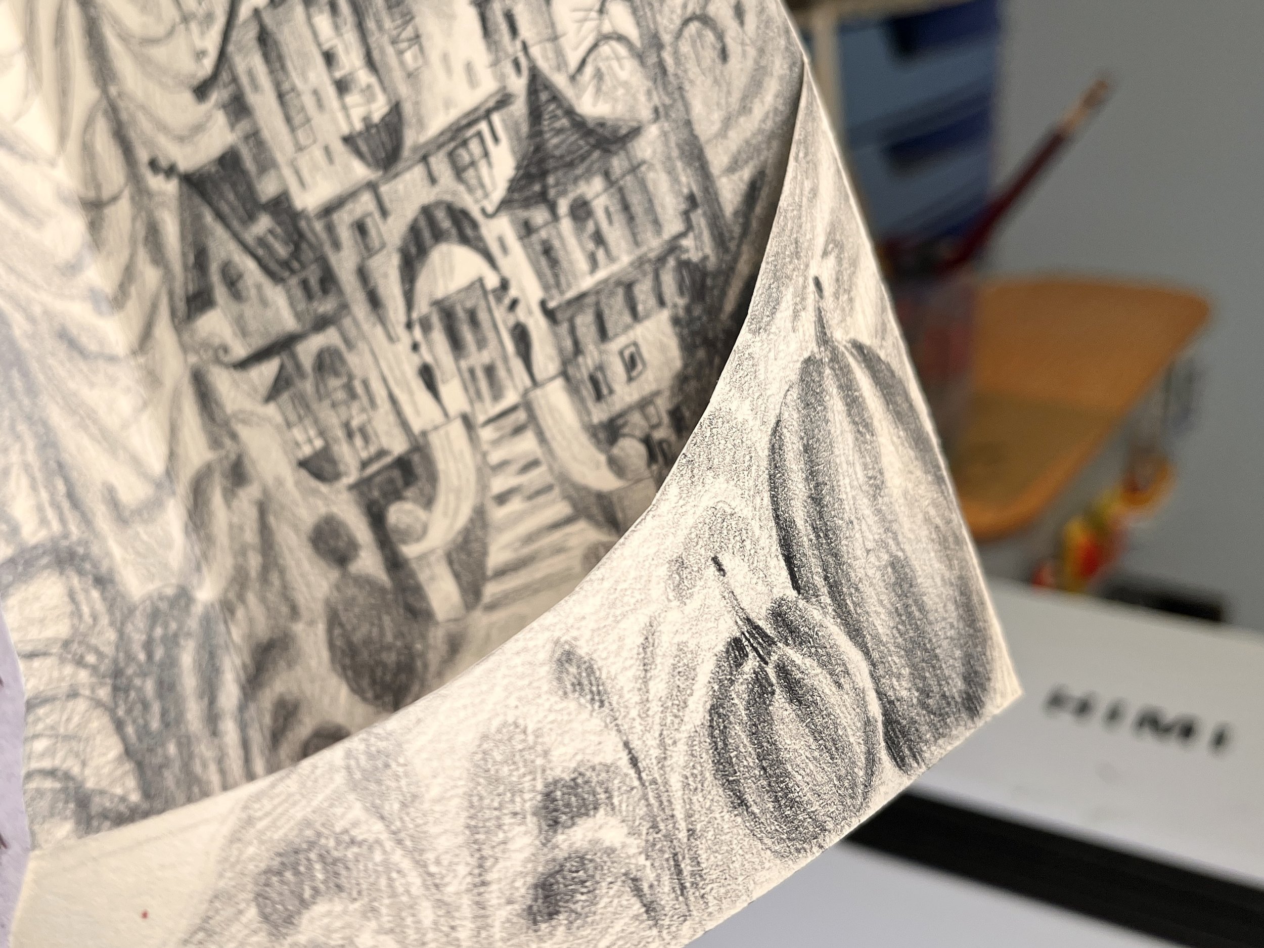
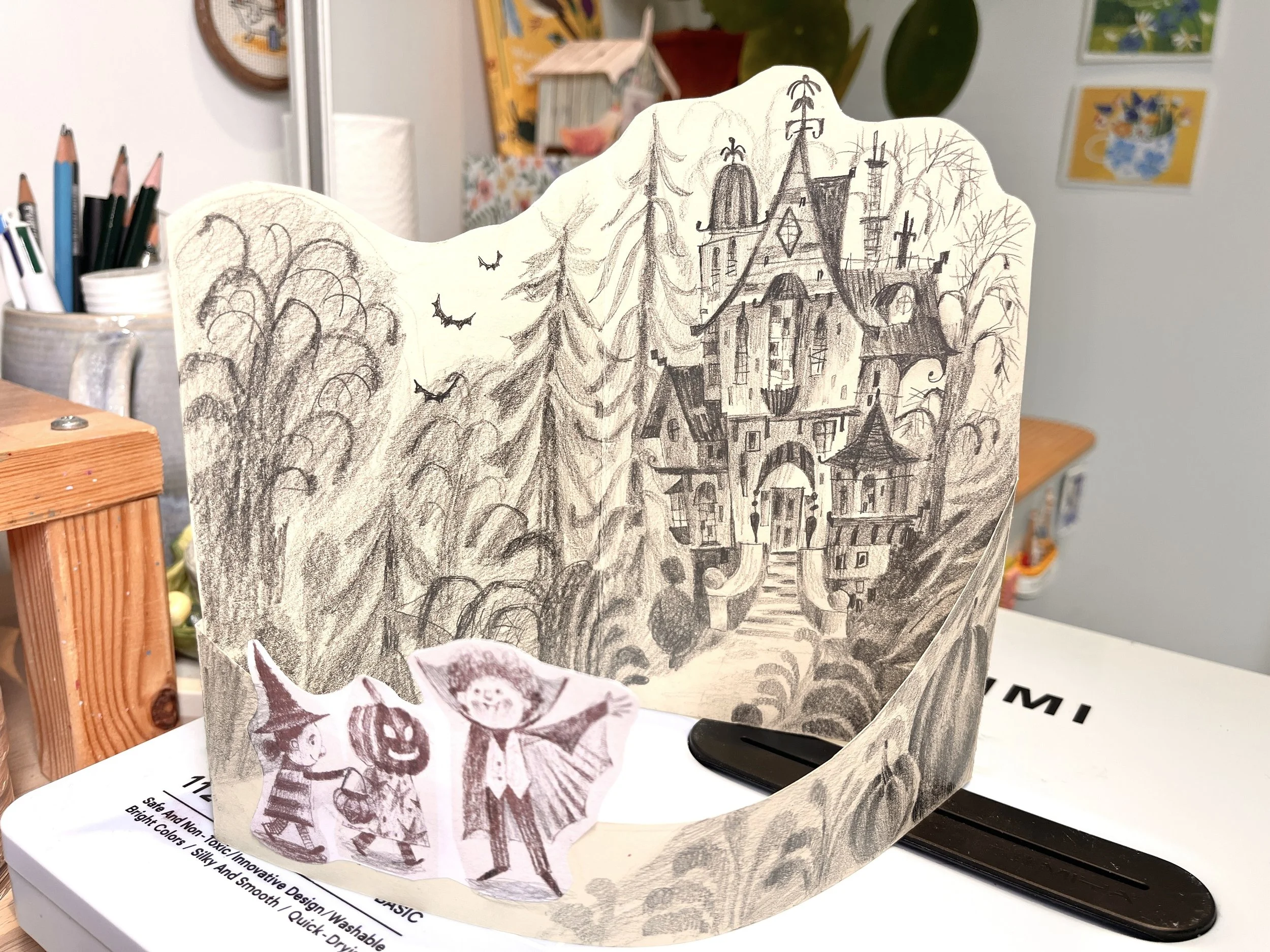
After a few attempts at drawing the house in my sketchbook, I picked my favourite and started to plan out How I would make it 3D, as apposed to just one flat illustration. By having a much shorter section in the front which wrapped round the main illustration with a fold in the centre it allowed the piece to stand up, whilst also working well for the story telling element as the kids are walking up the path to the house.
Once I had my final sketch, it was time to plan out the colours. I always do this digitally, as it gives me the most freedom to try out loads of options fairly quickly. For those curious to do these, I just scan in my sketch and bring it into photoshop. I turn my sketch layer to a very low opacity and set it to multiply (which is a way to make all the white on a layer become transparent). This lets me add colour to the layer below while still seeing all my pencil lines.

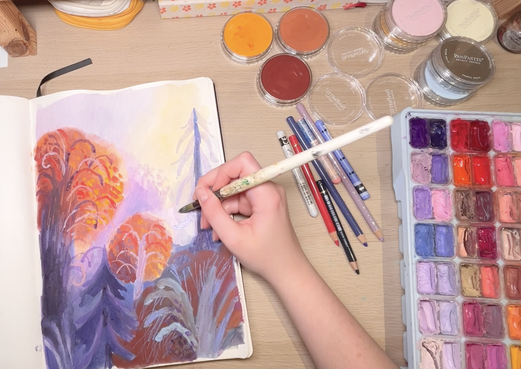
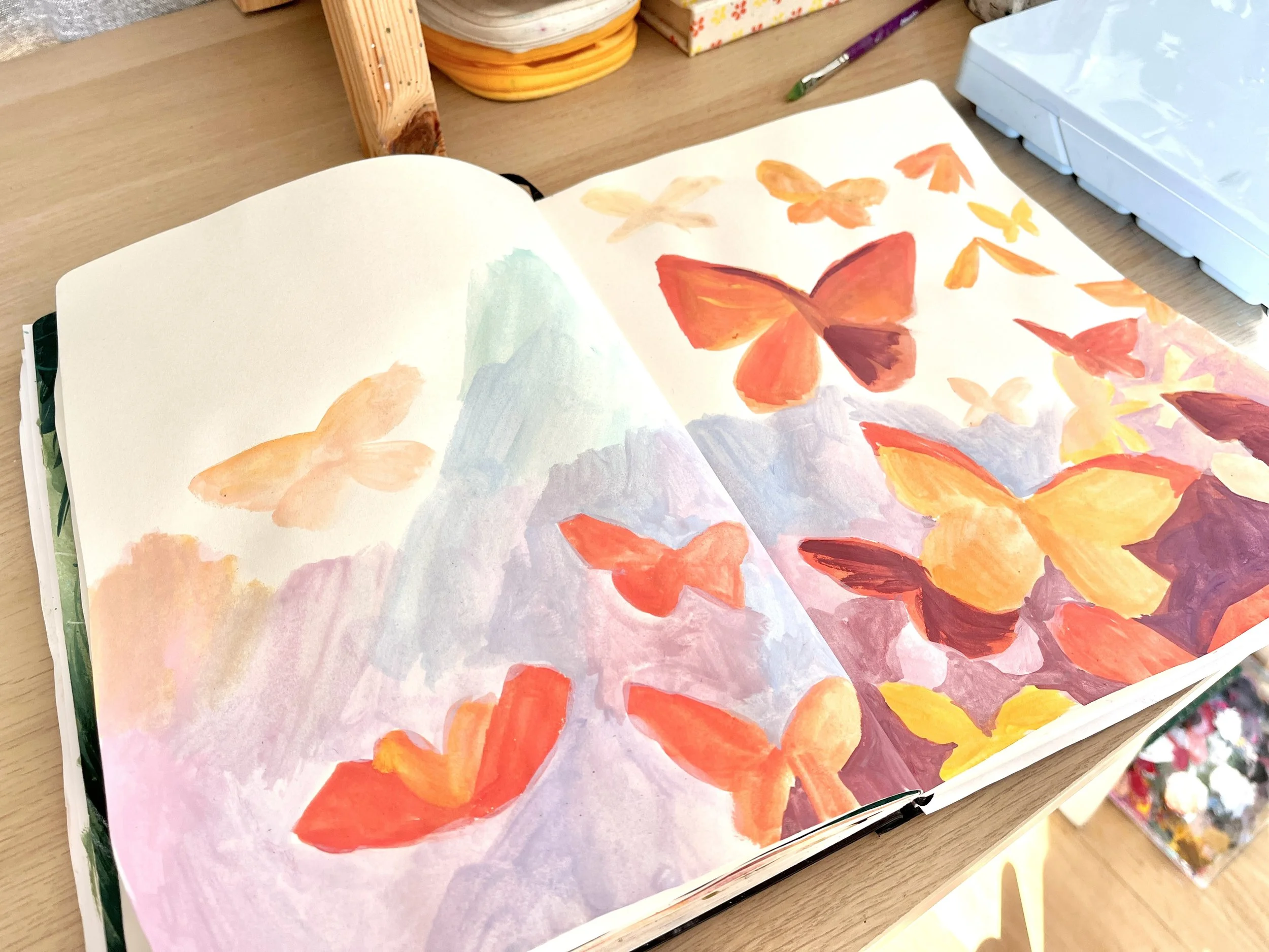
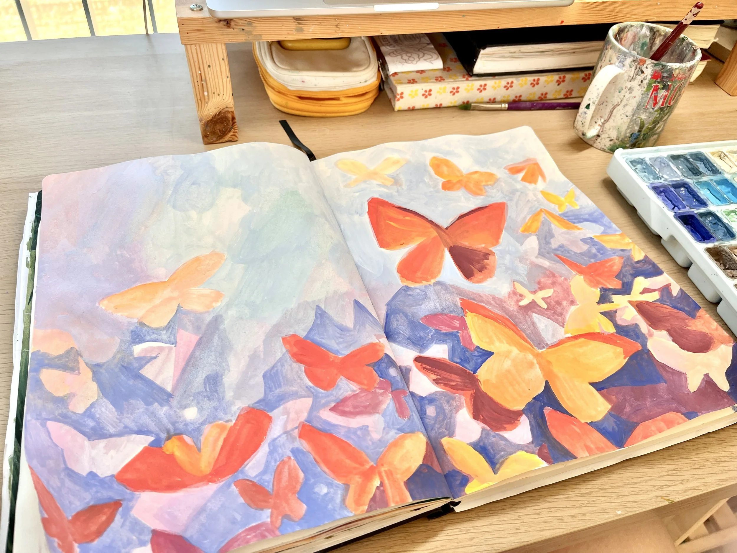
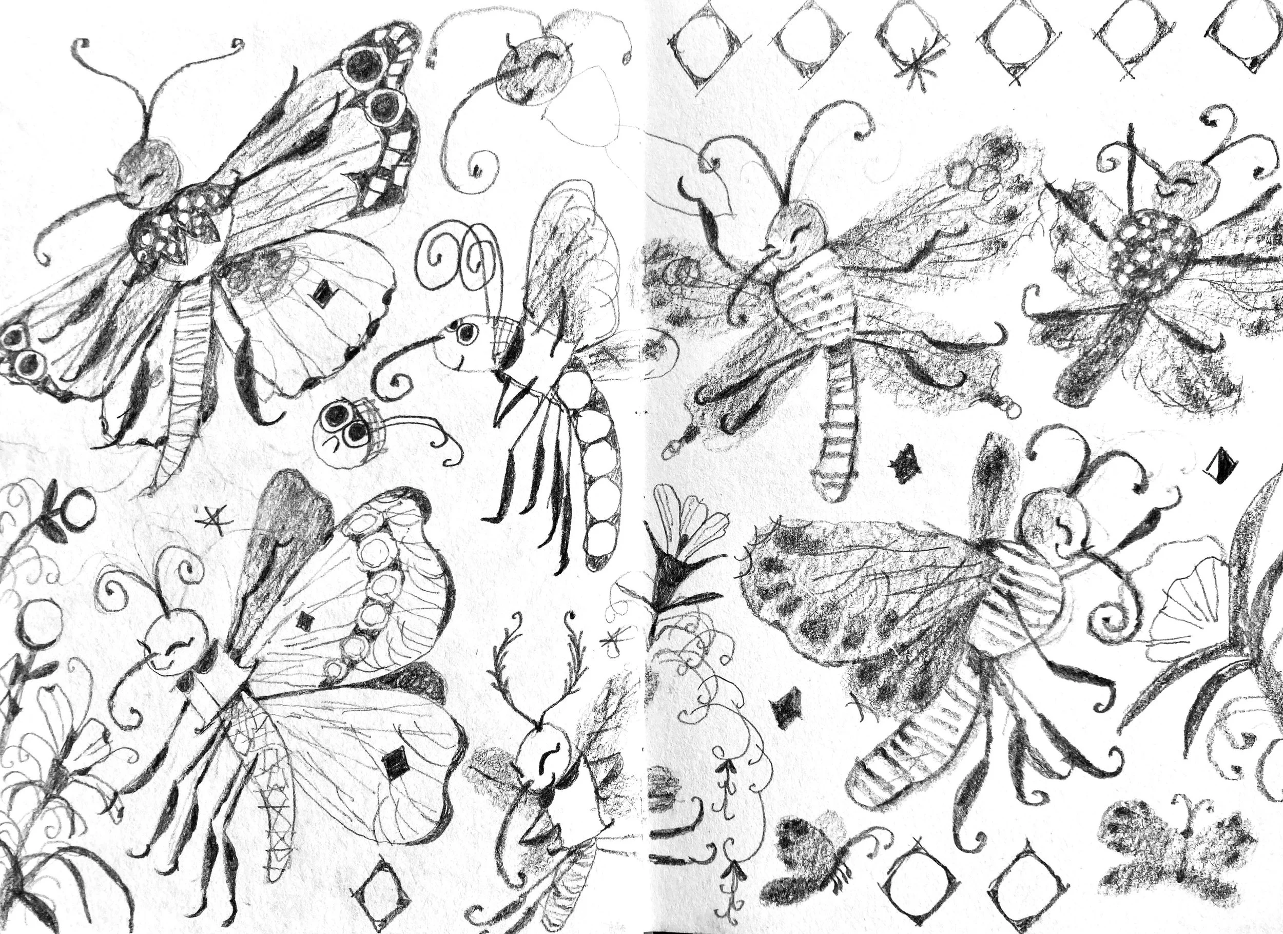
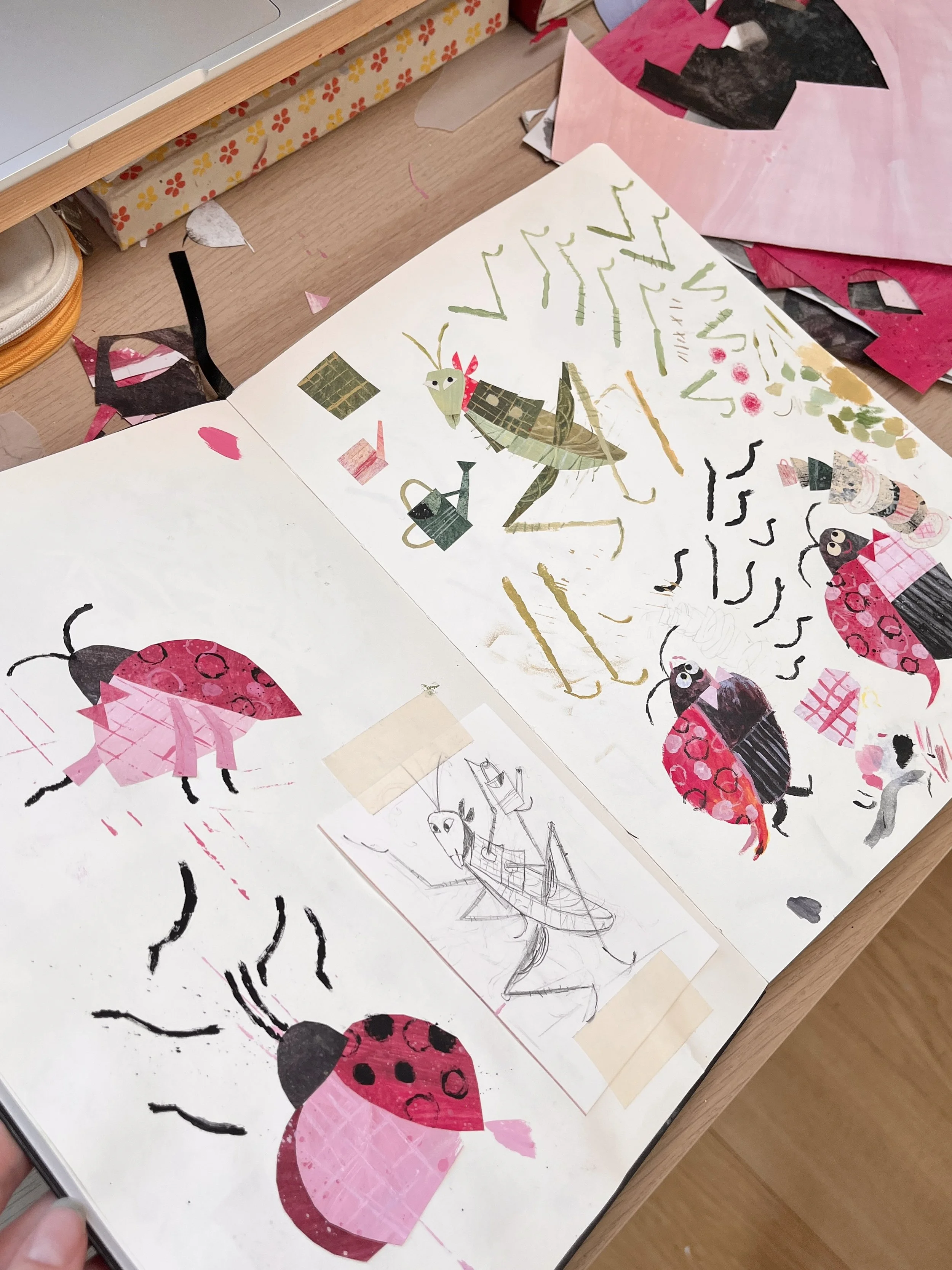
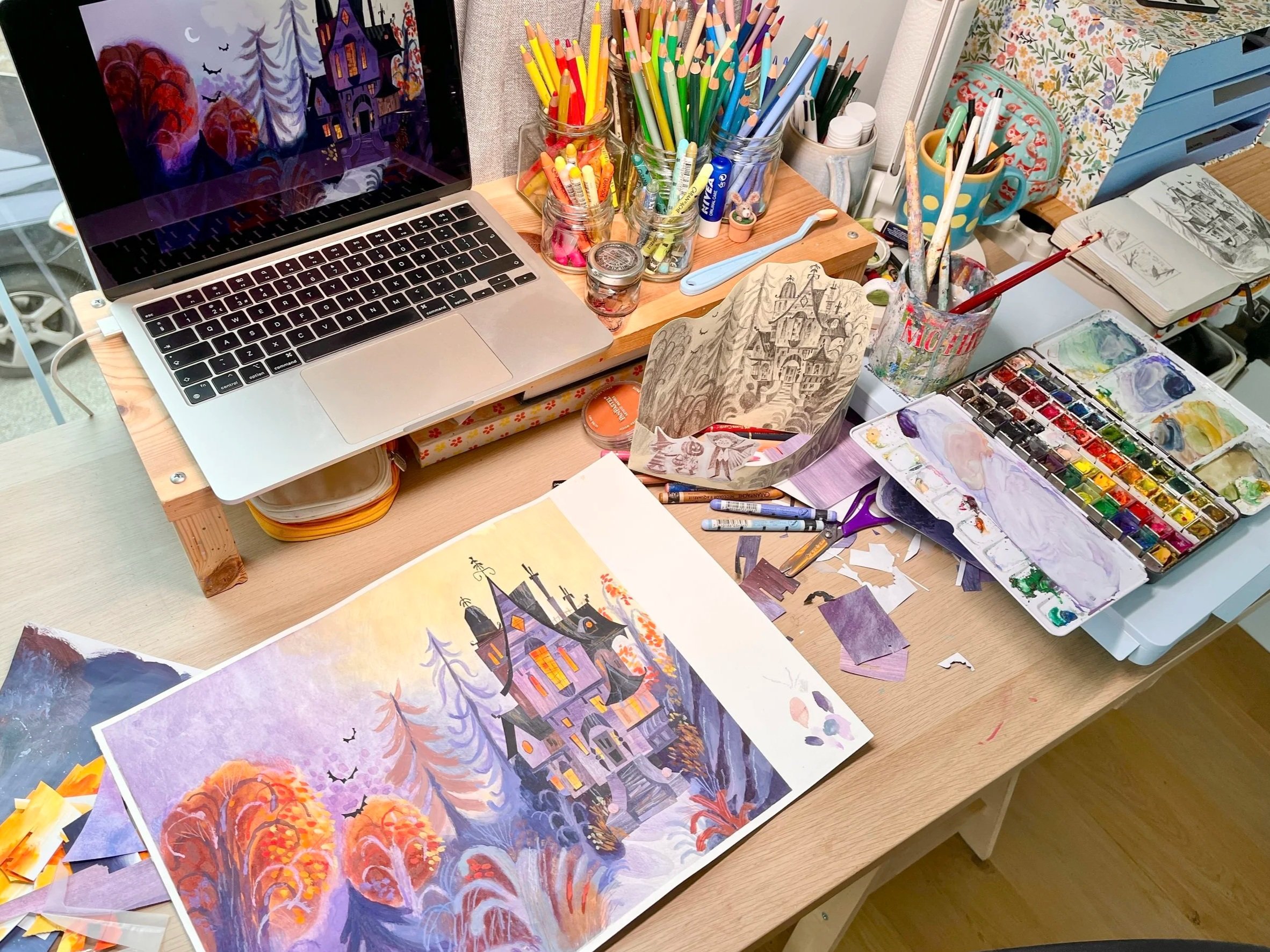
With my colour plan finalised, I decided it would be helpful to do a quick practice run in my sketchbook, mainly to figure out what media to put where and check they were compatible. I enjoy using a mix of pan pastels, watercolour, gouache, pencils, and Neo colour crayons. For the most part these work well together, but there are times when certain medias, struggle to layer on top of the pastel, especially if I’ve laid it on thick. So a practice can help me understand the order to put media down and what to avoid!
Once I had a plan of action, I moved on the the final. No matter how many pieces of art I make, I still feel scared every time I start the final. You’d think I’d have gotten used to it by now! So Here’s the order of business:
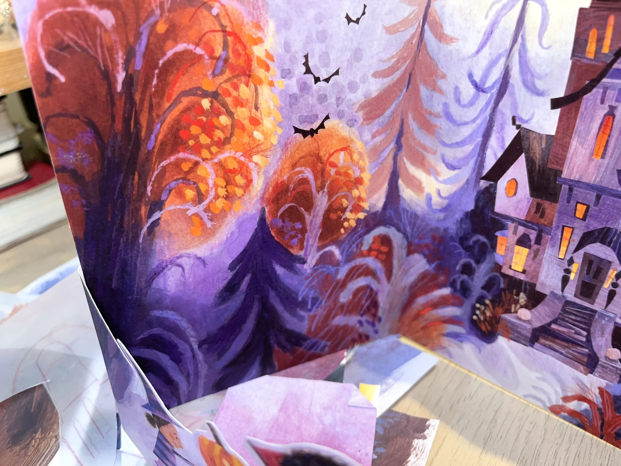
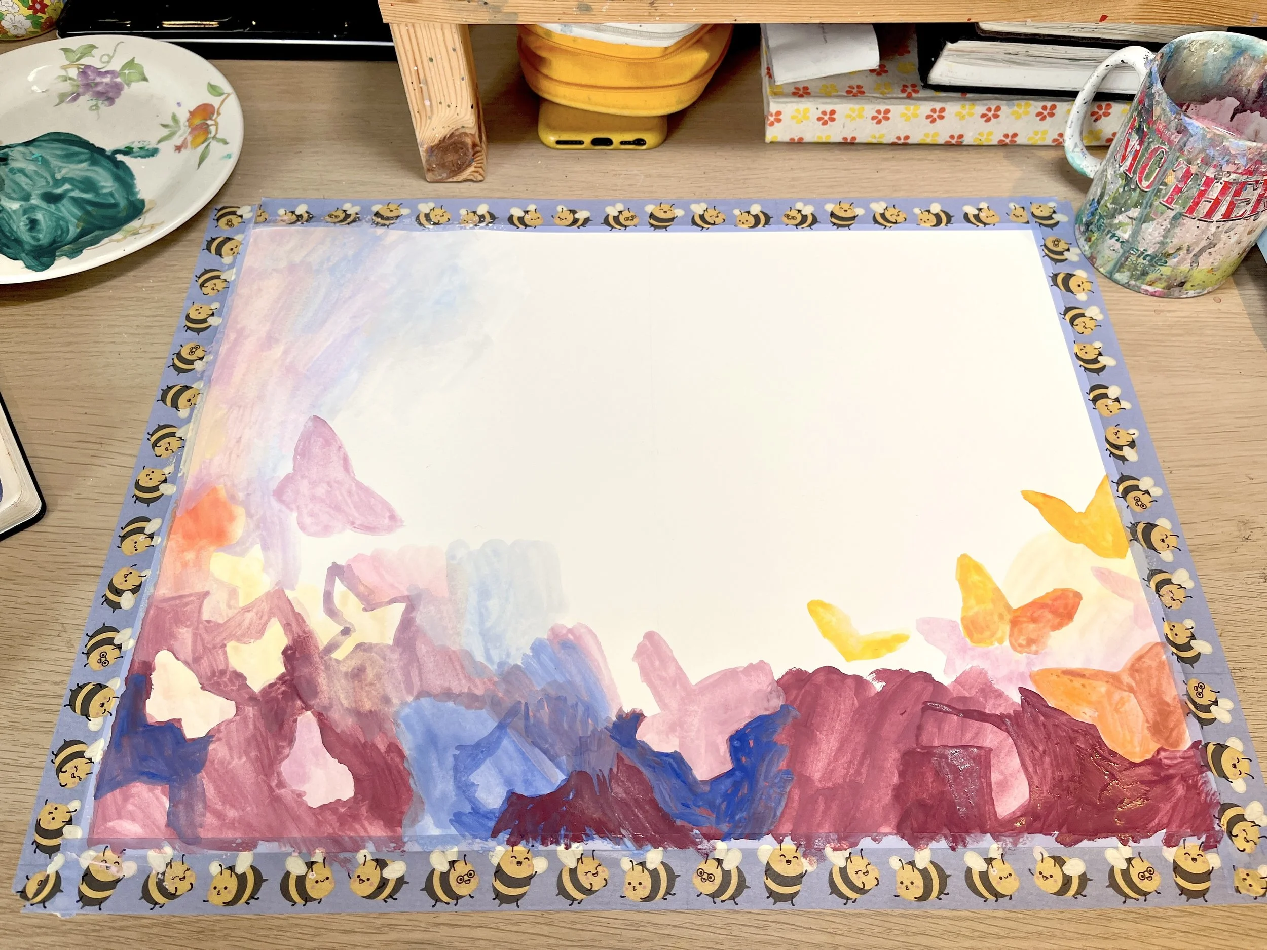
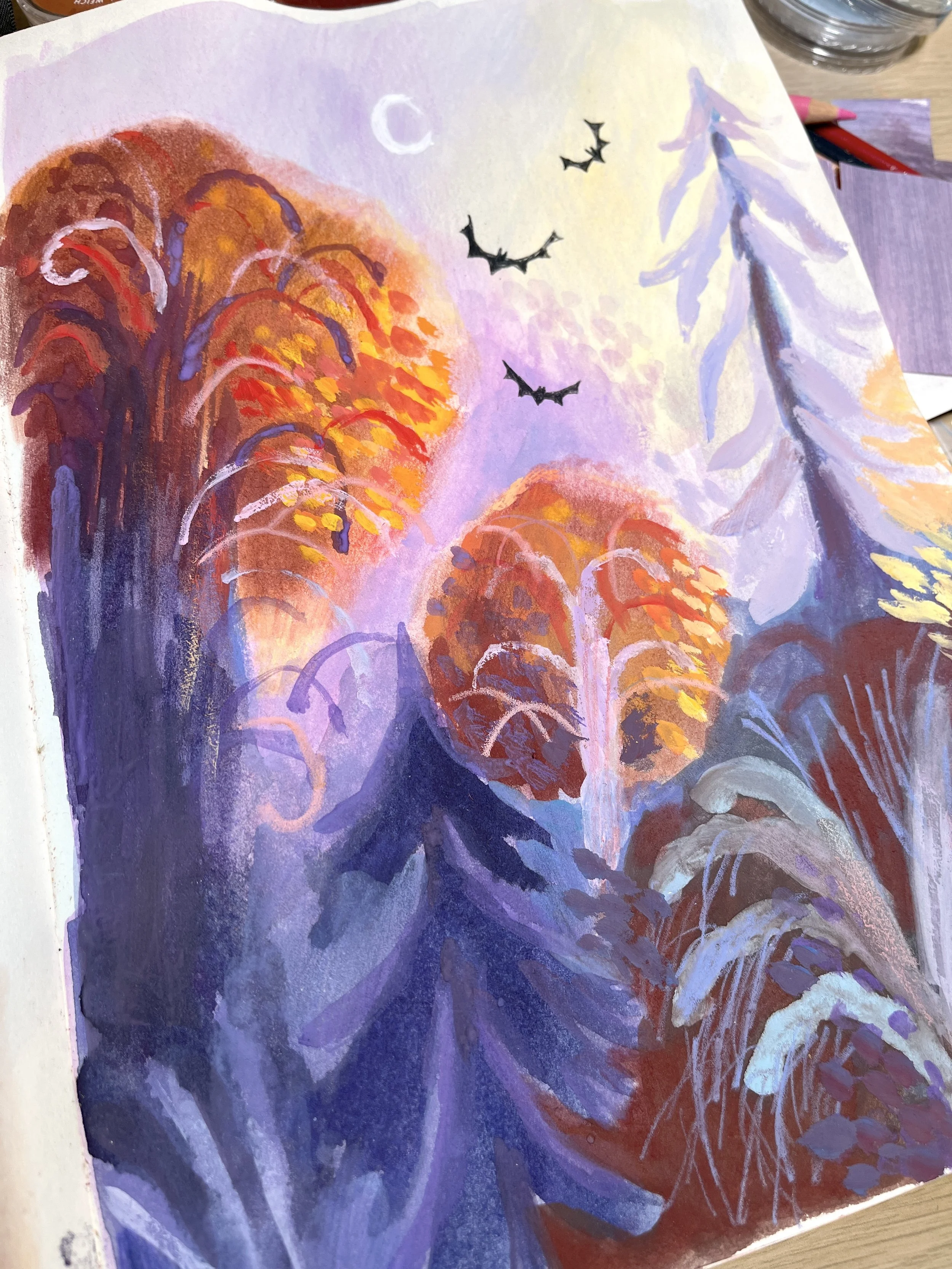
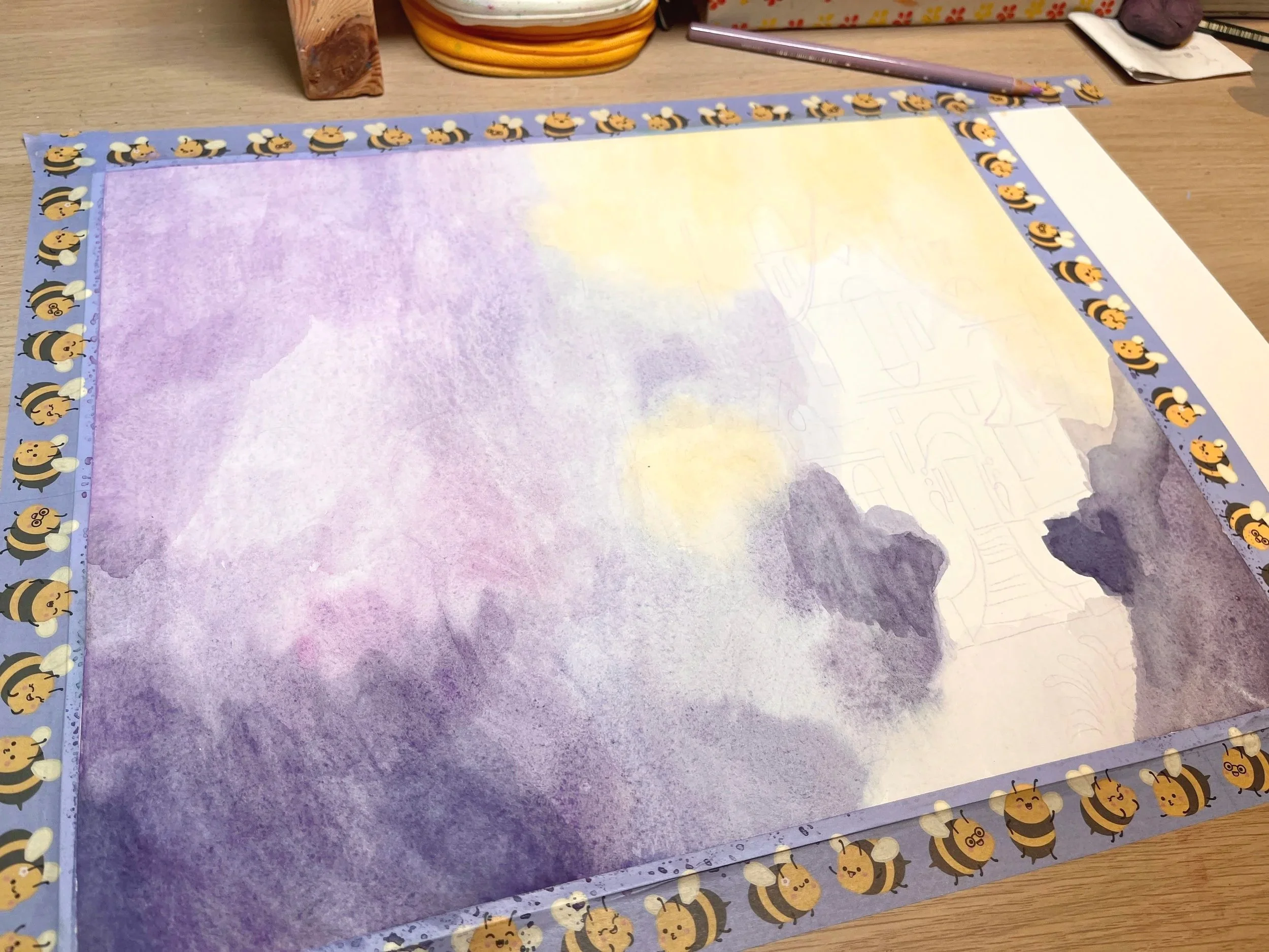
Water colour base (wet on wet technique to get lots of lovely colour bleeding on the paper)
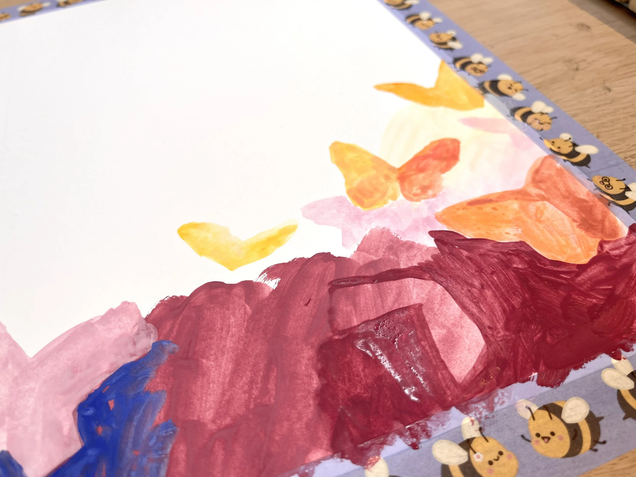
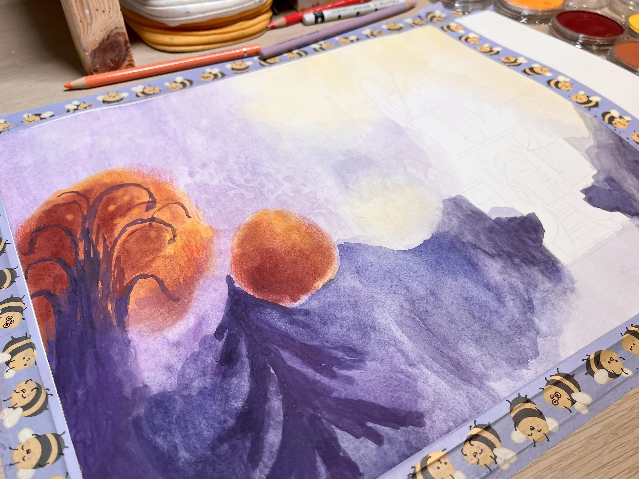
Working back in to this with more watercolour and very thin gouache
For the orange trees I used pan pastels as a base, which I worked into with a thicker gouache for the branches
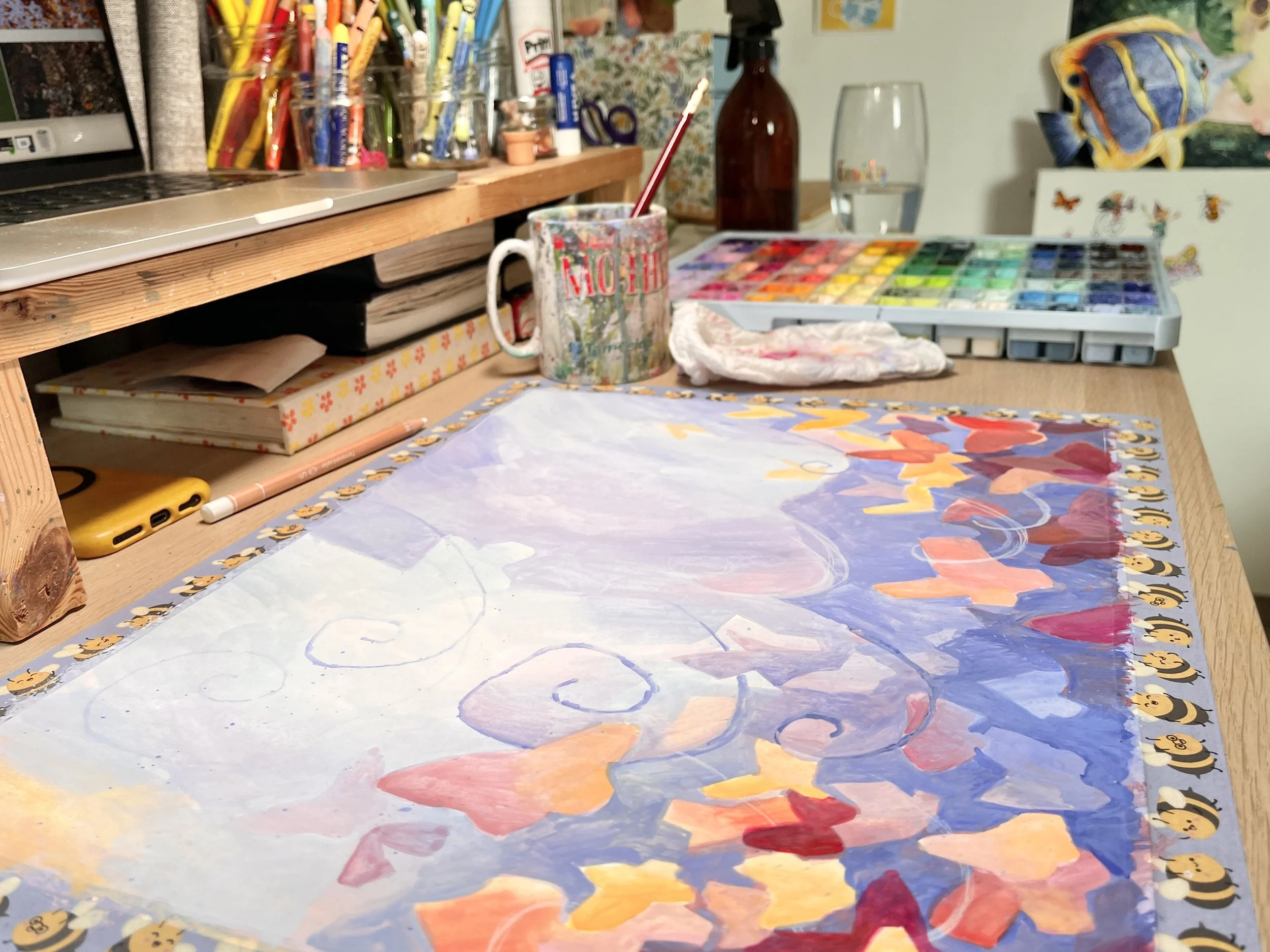
Most of the foliage was painted with gouache and for the dark red sections, I used my pan pastels
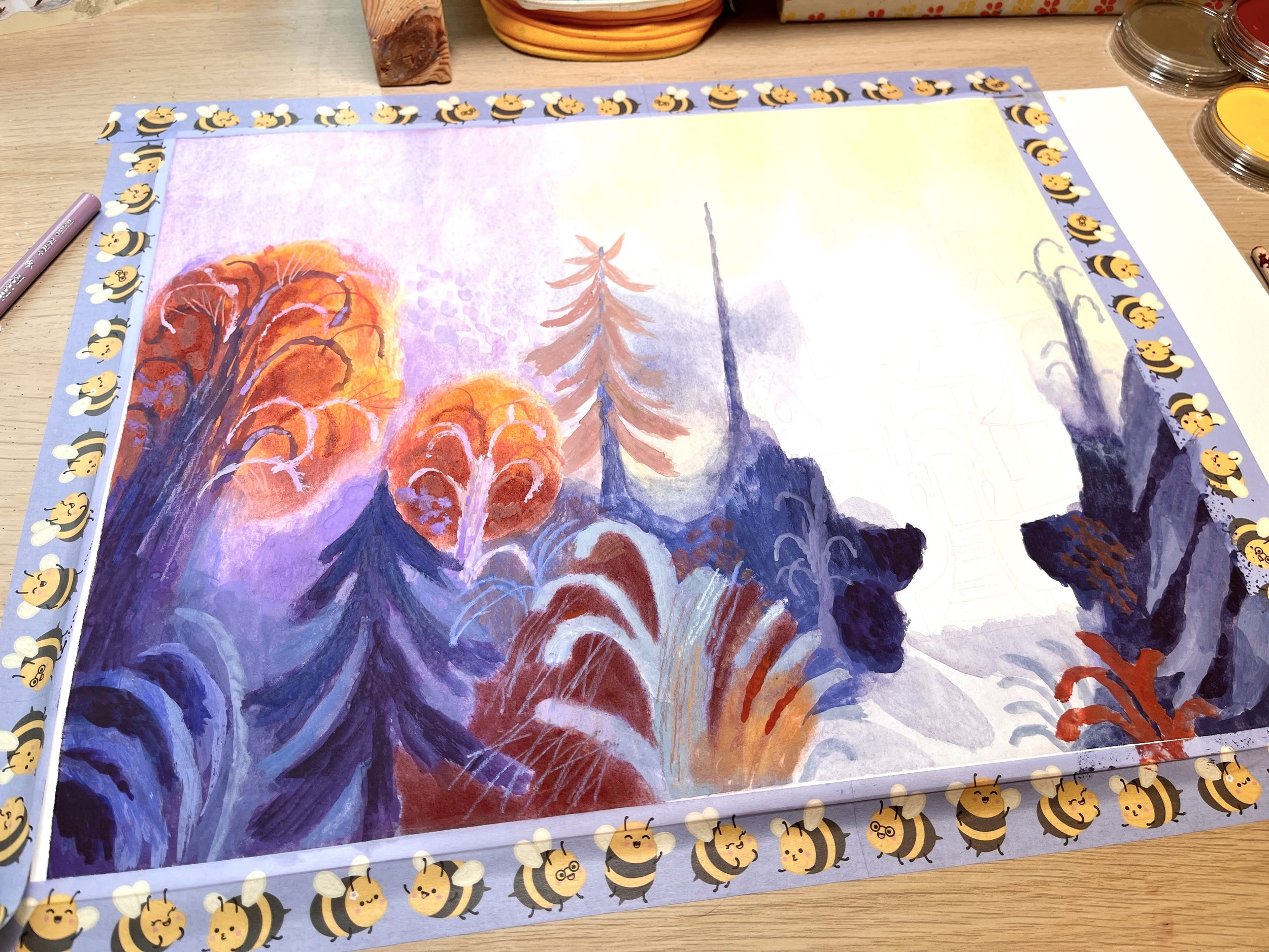
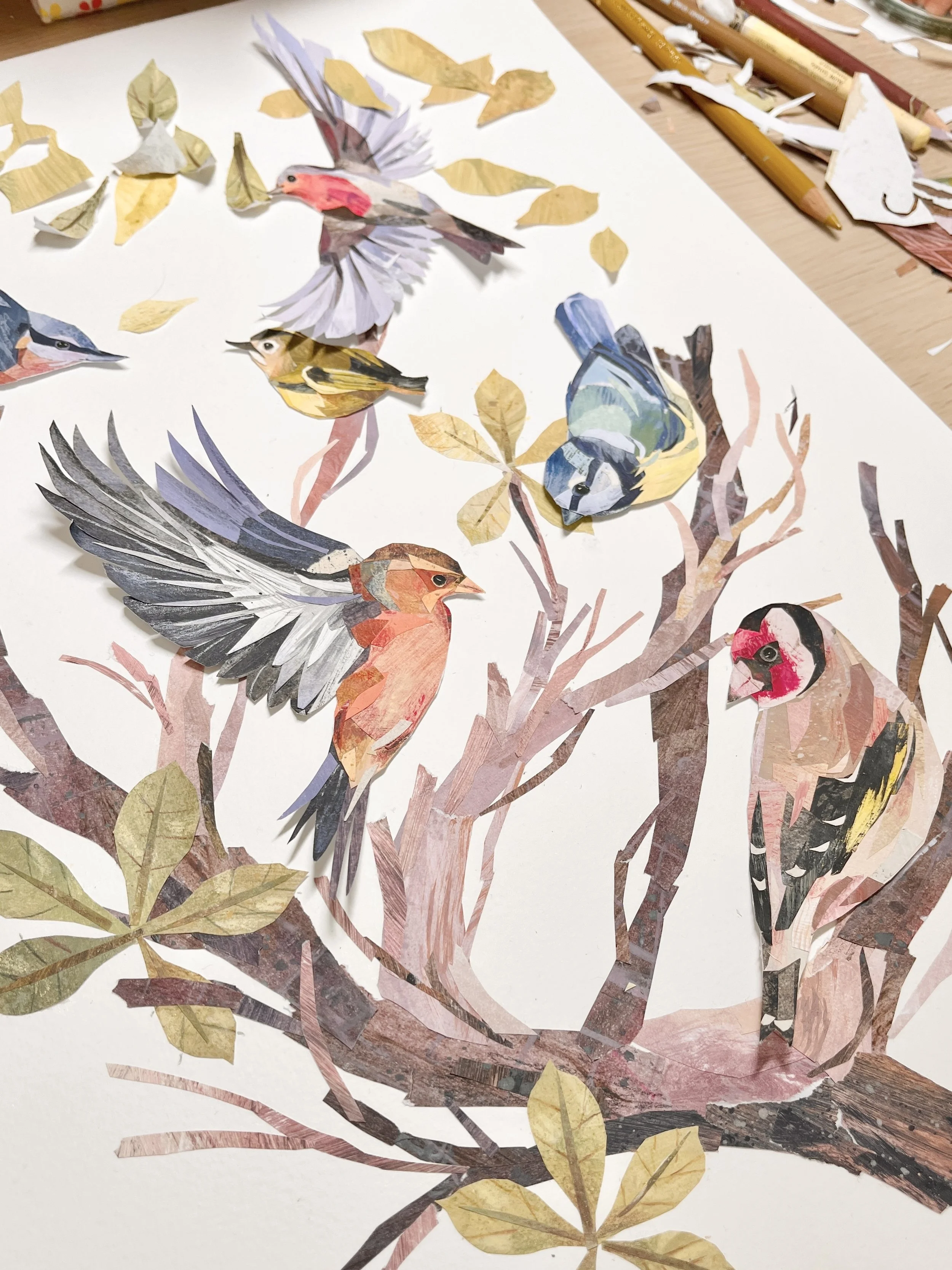
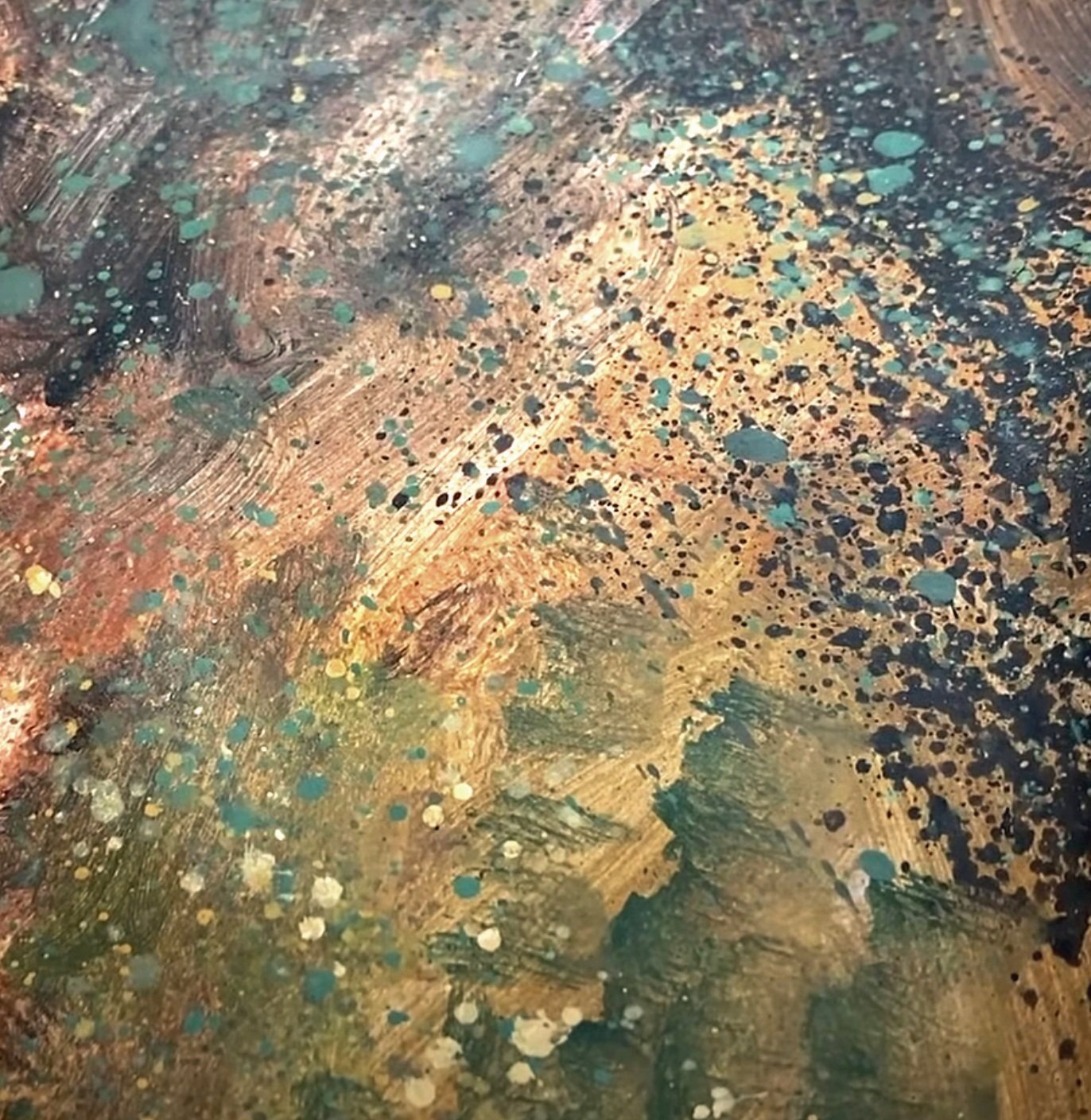
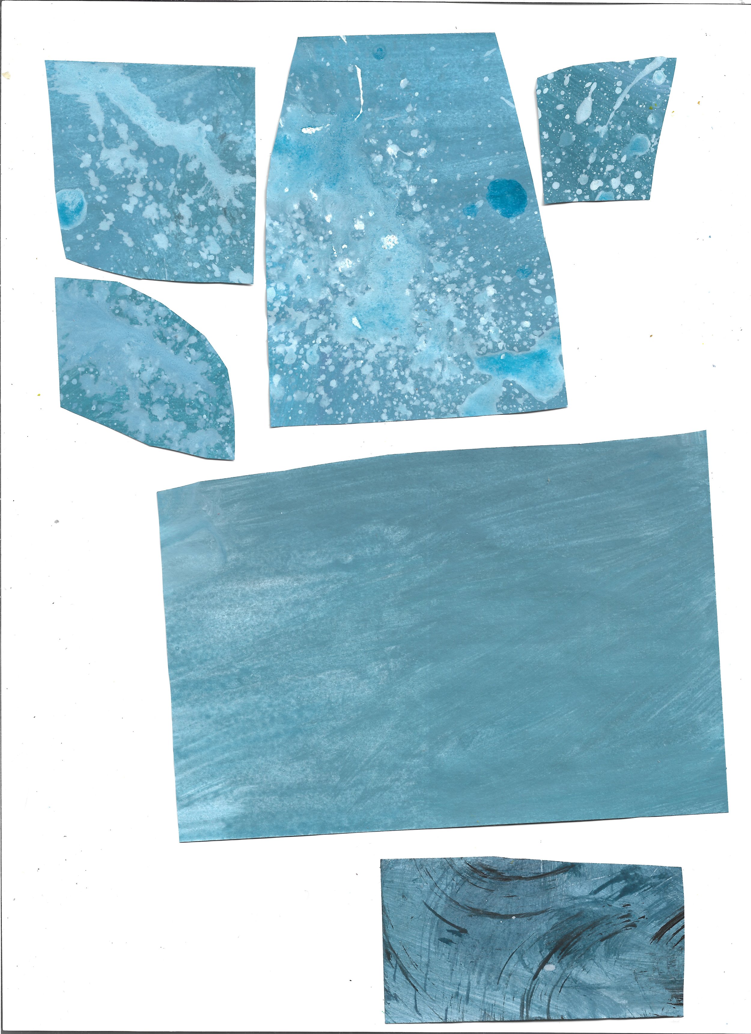
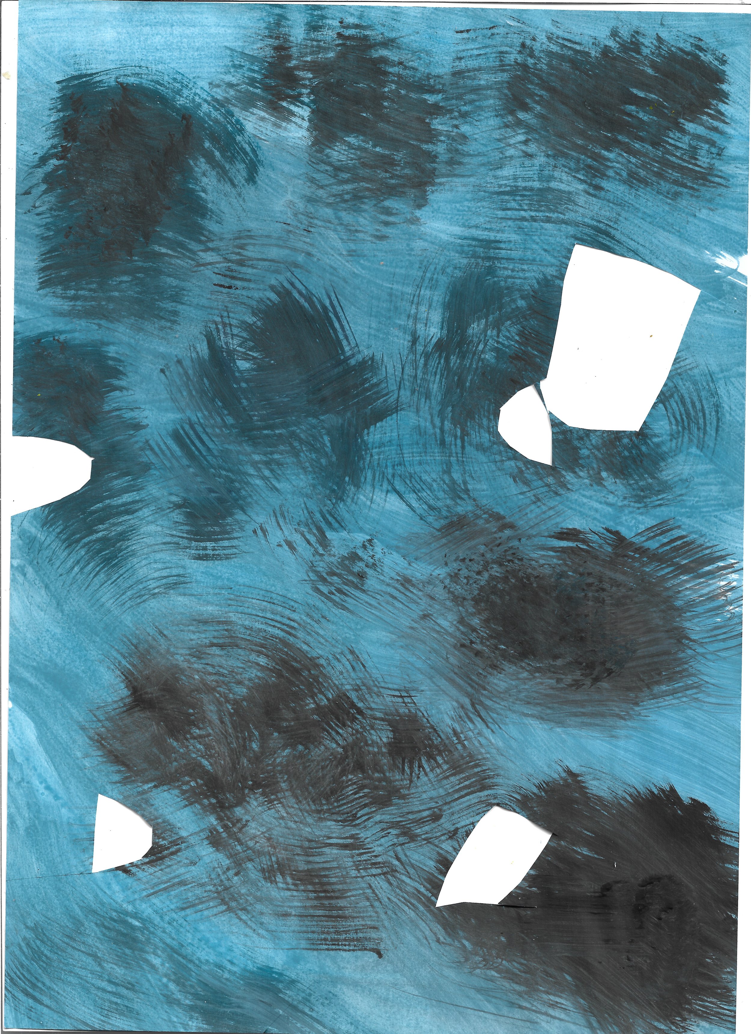
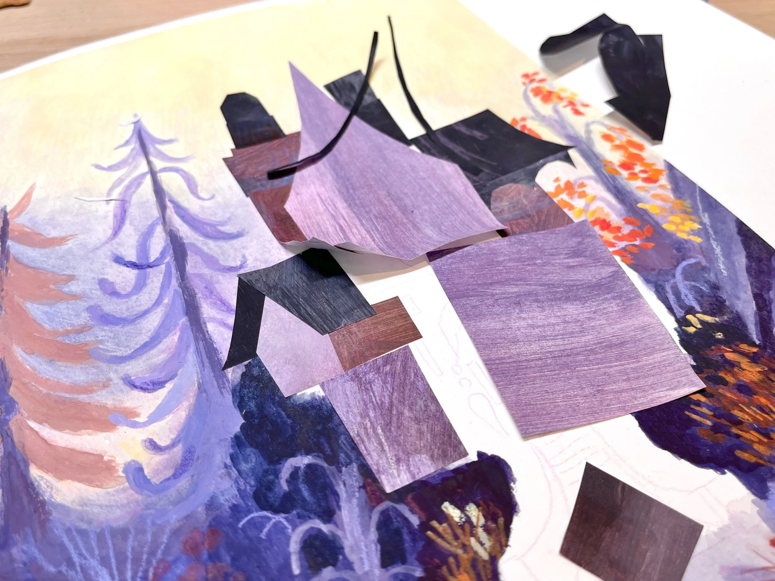
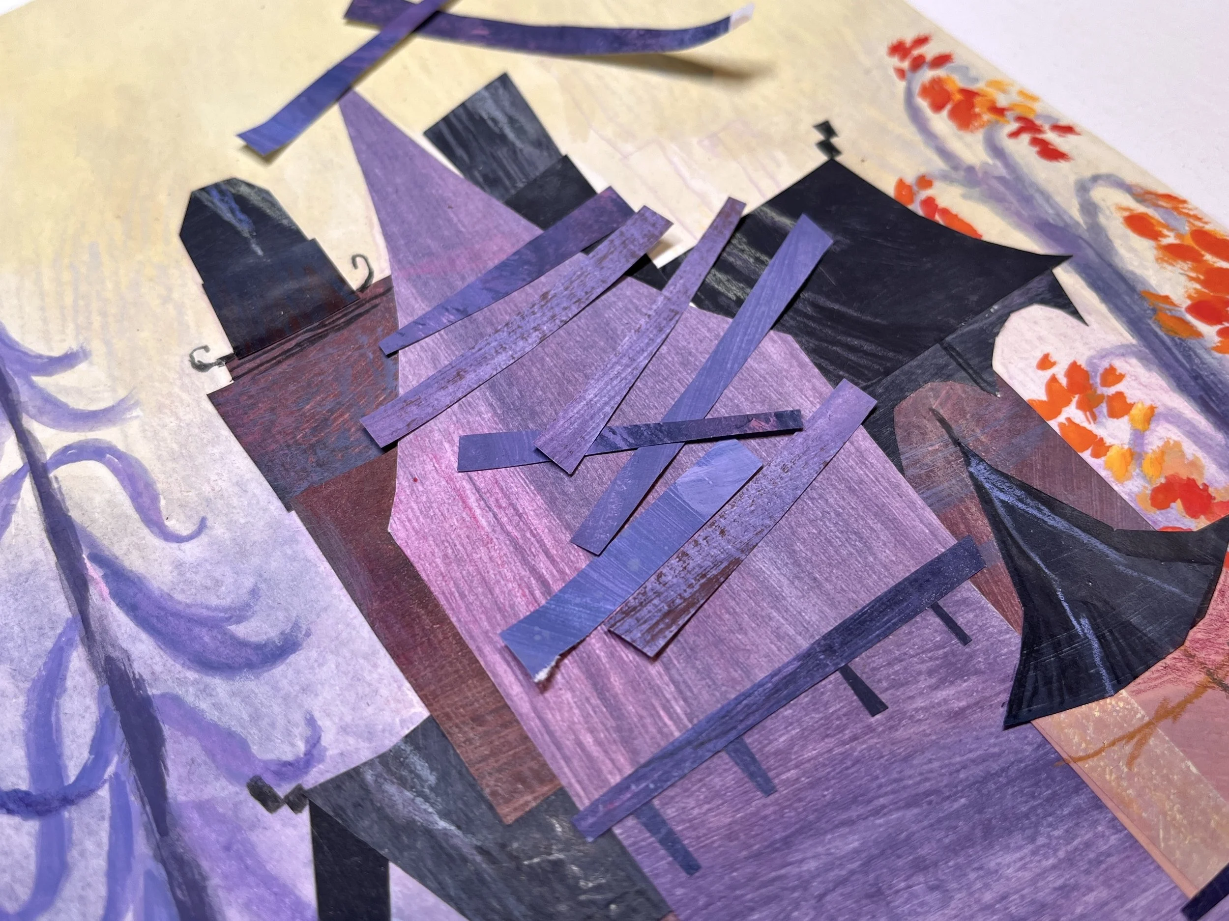
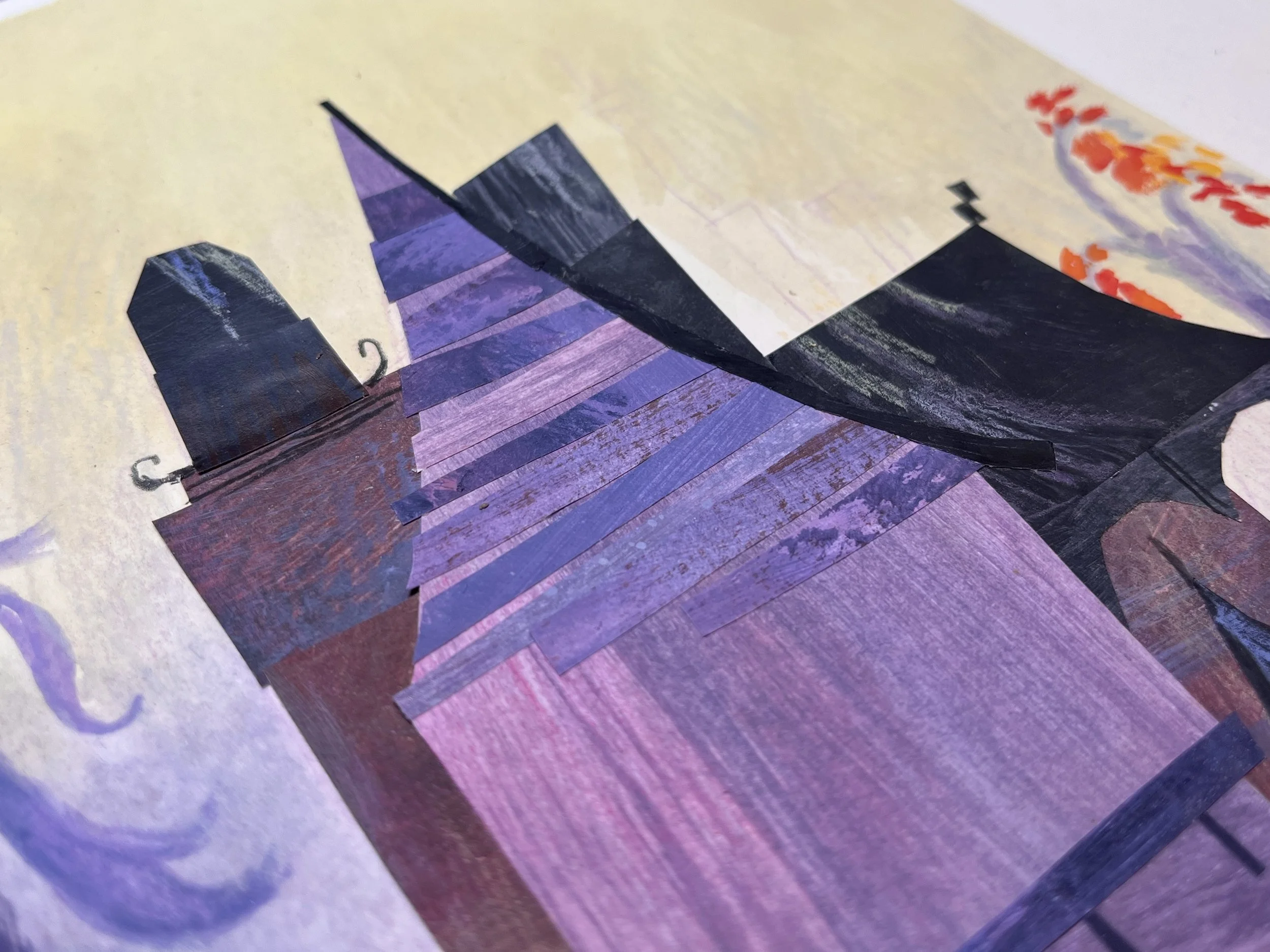
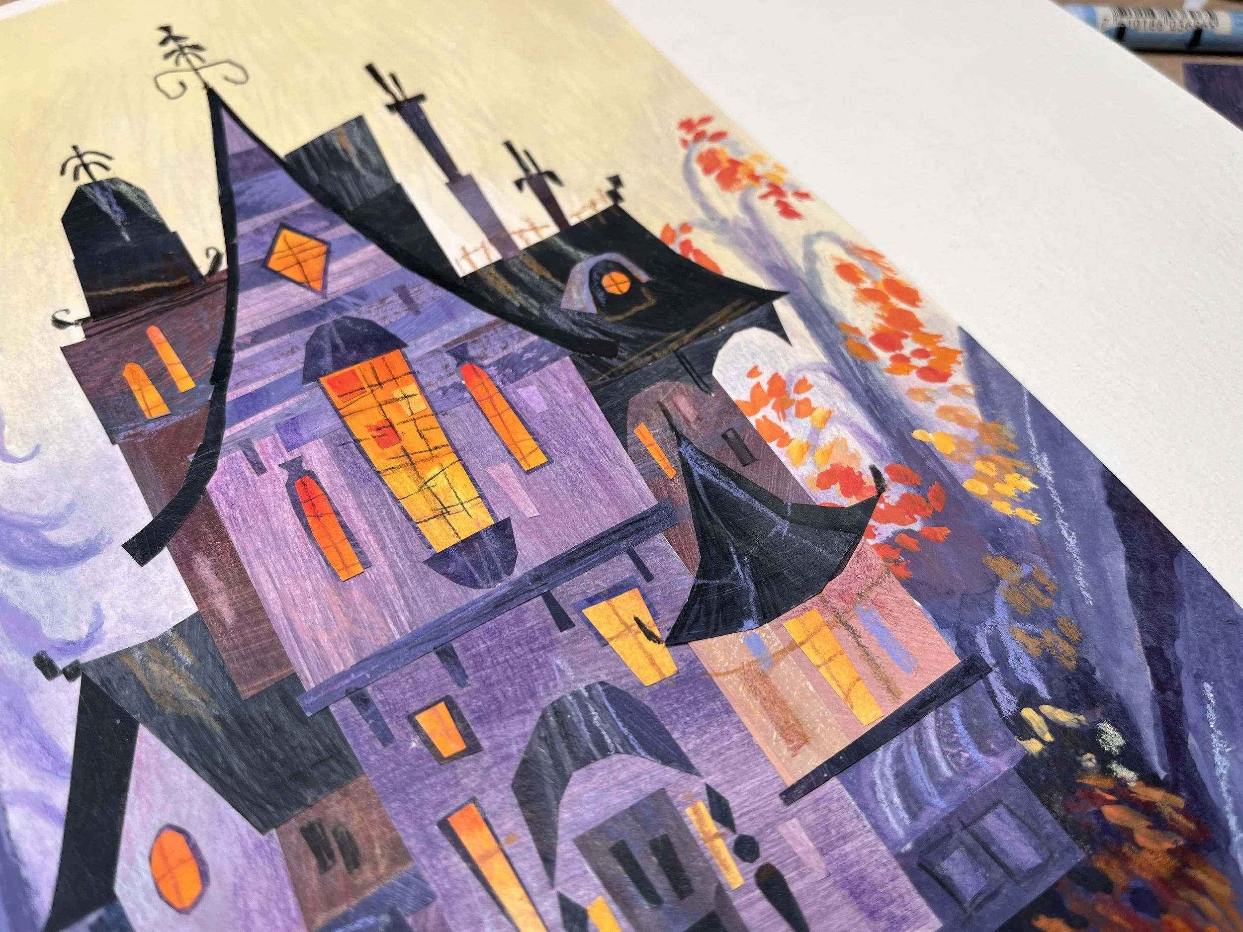
Once the background was complete, I painted a bunch of printer paper with acrylic paint to prep the textures for the house
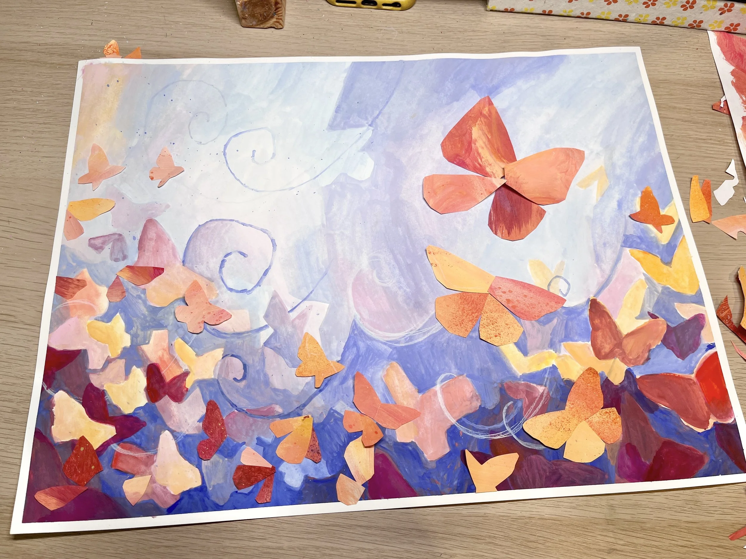
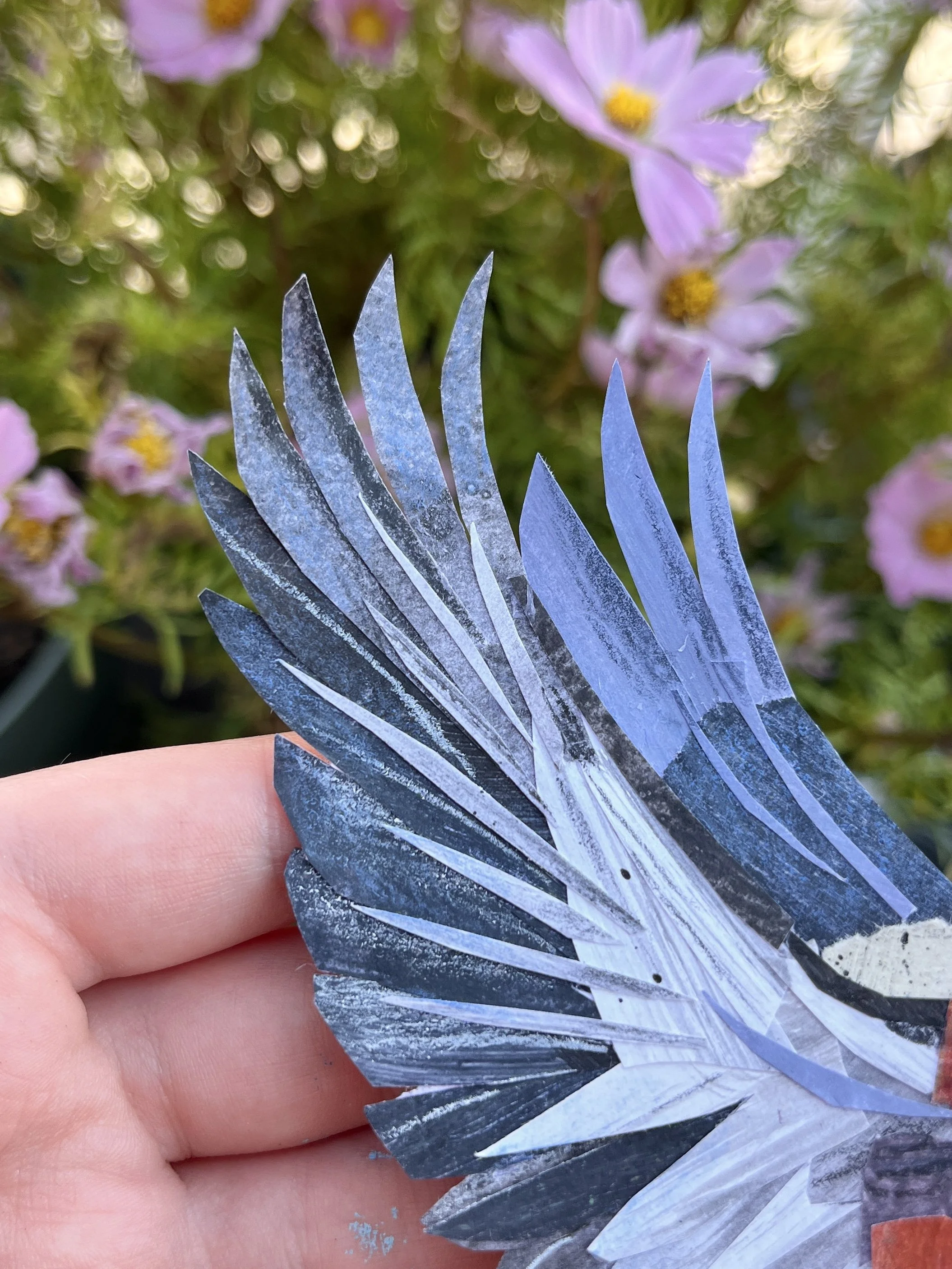
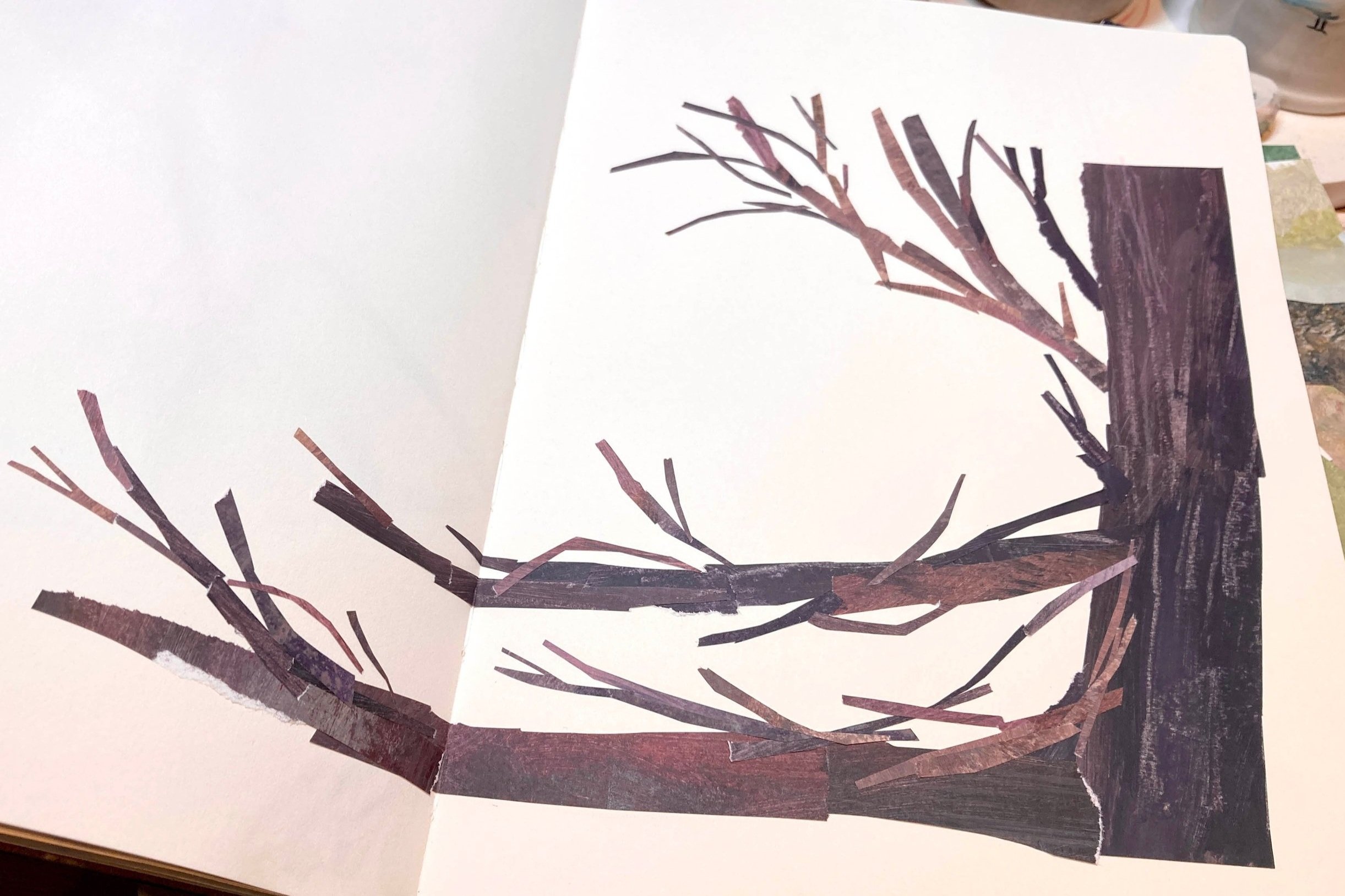
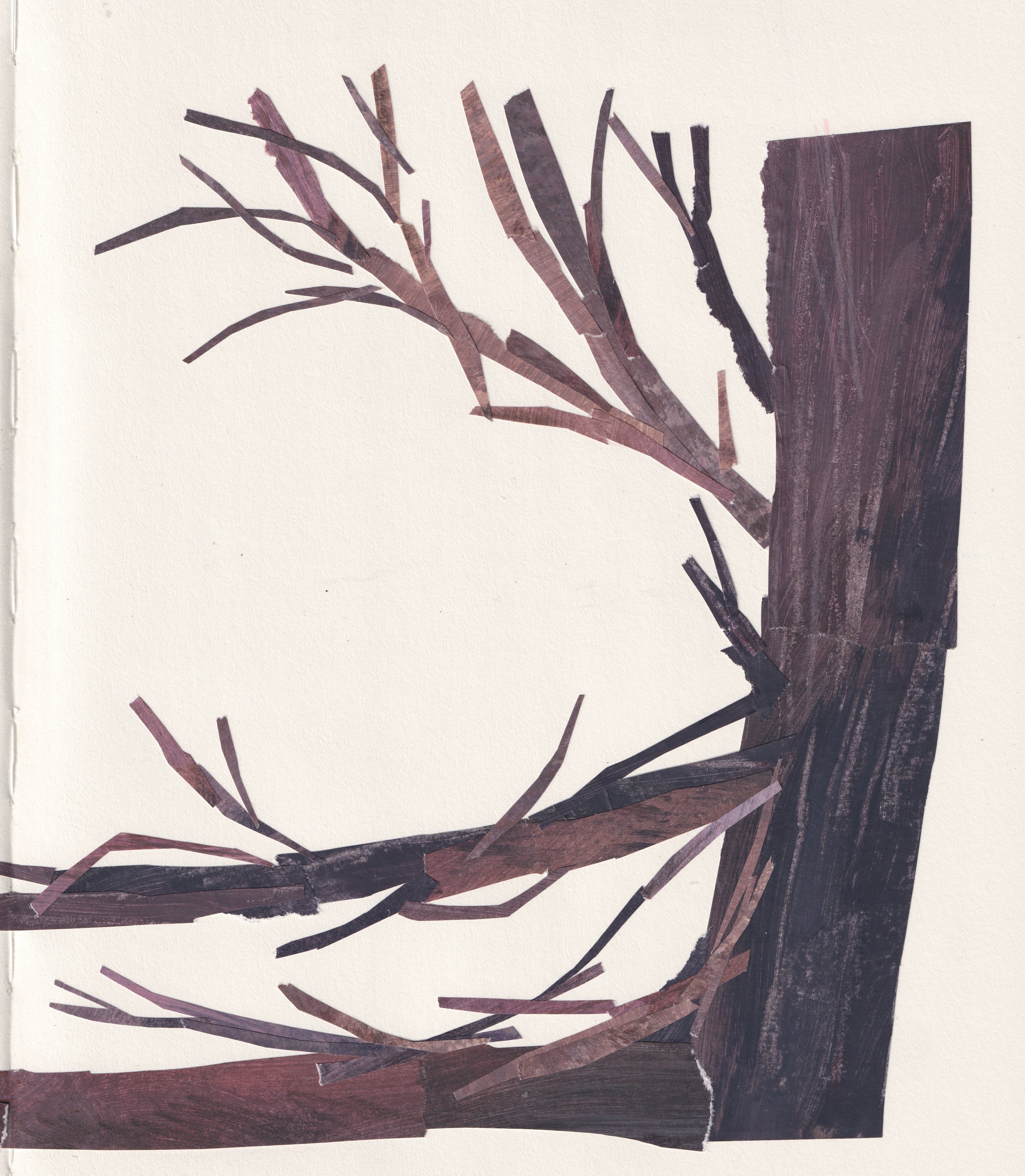
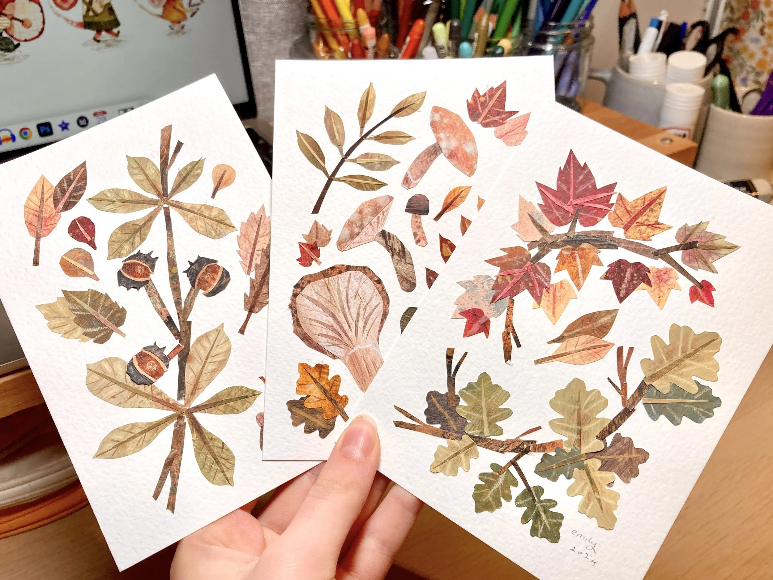
I traced my house on to tracing paper and used this as a template to cut out all my shapes
For some of the pieces which were too light, I had to work back into them with watercolour to add a wash of colour and darken the piece as a whole, without losing any lovely texture!
I stuck everything down and used coloured pencils and Neo colours to add final details!
And with that, the main illustration was finished, but there was still more work to do.
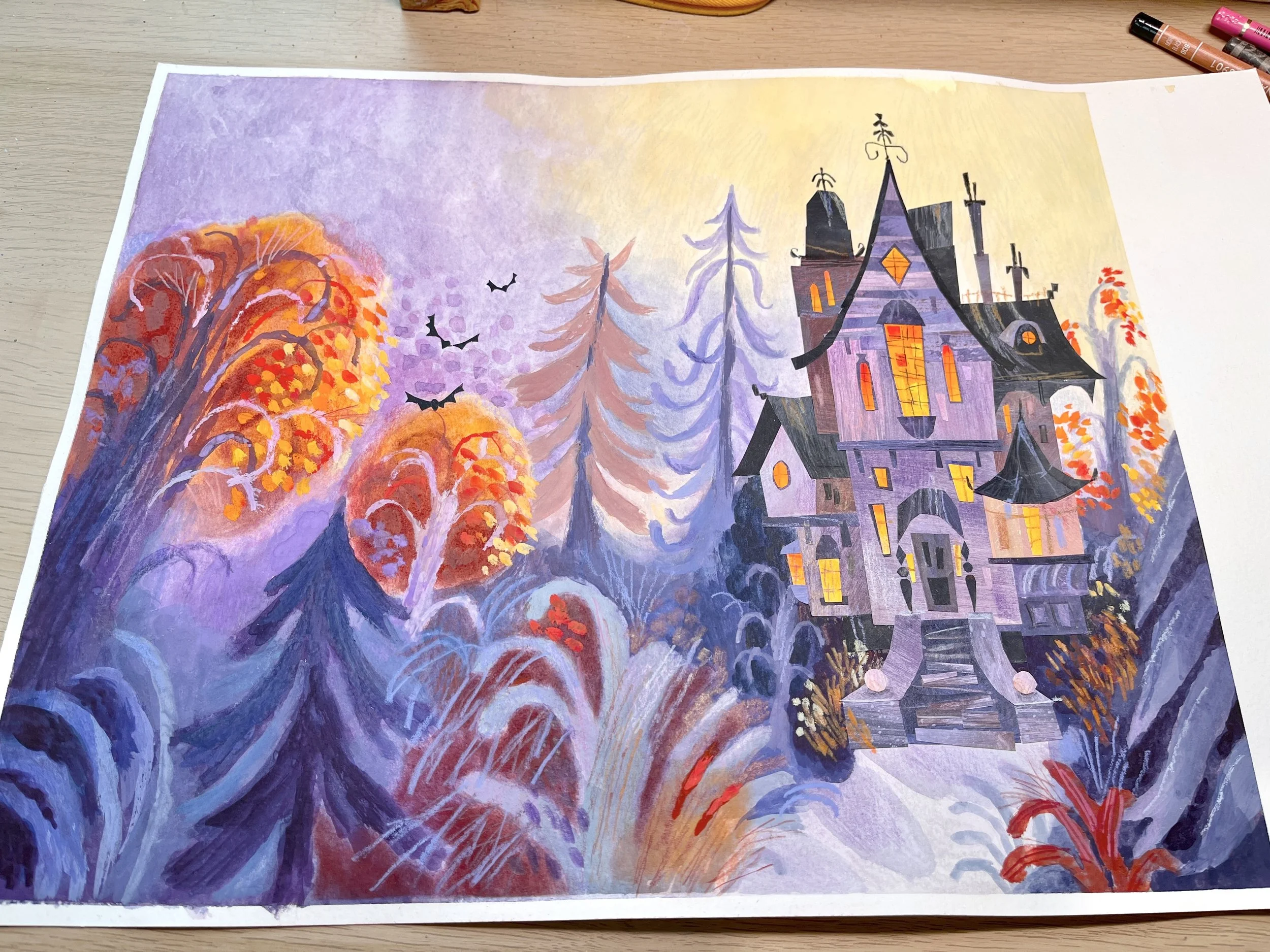
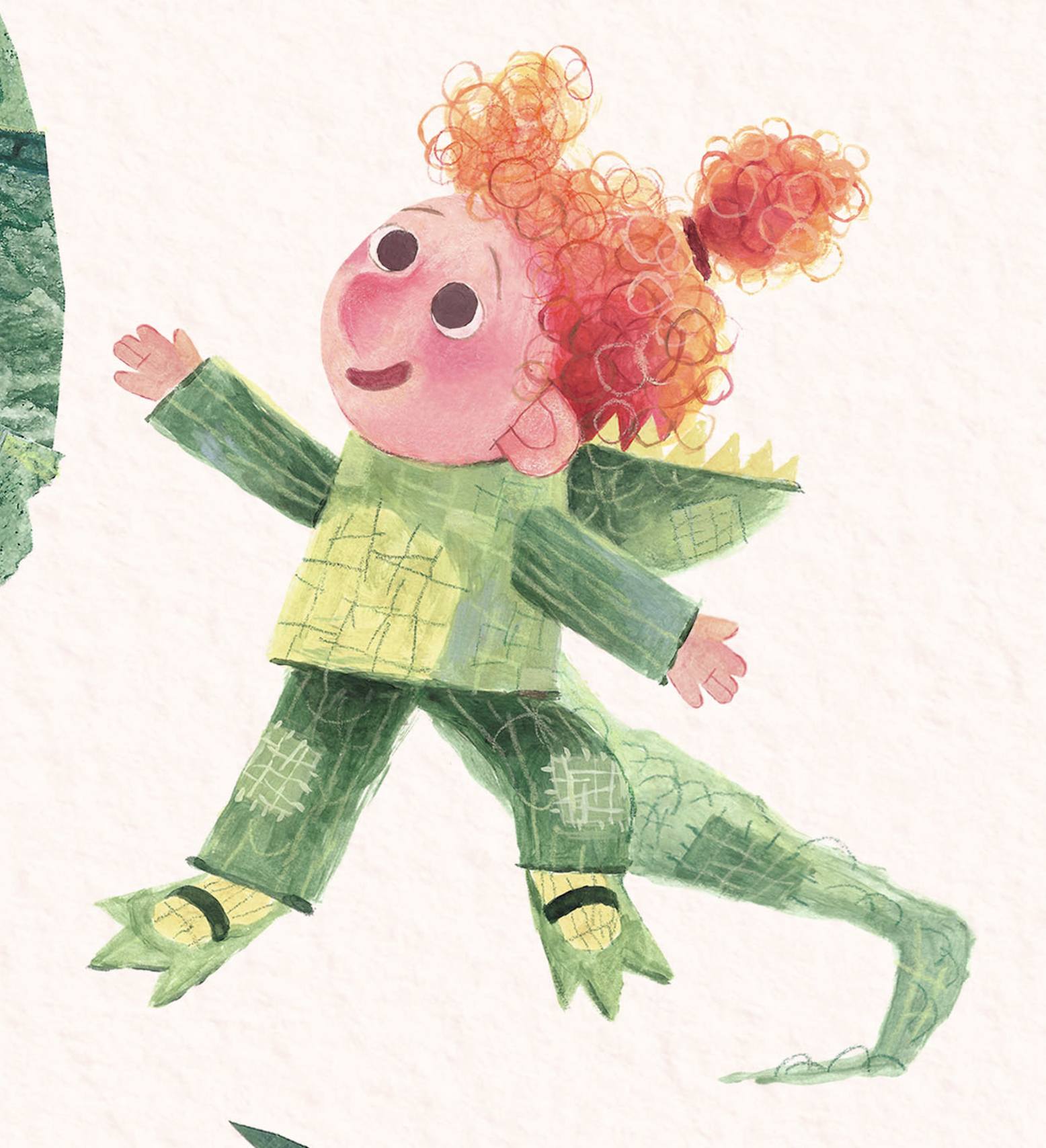
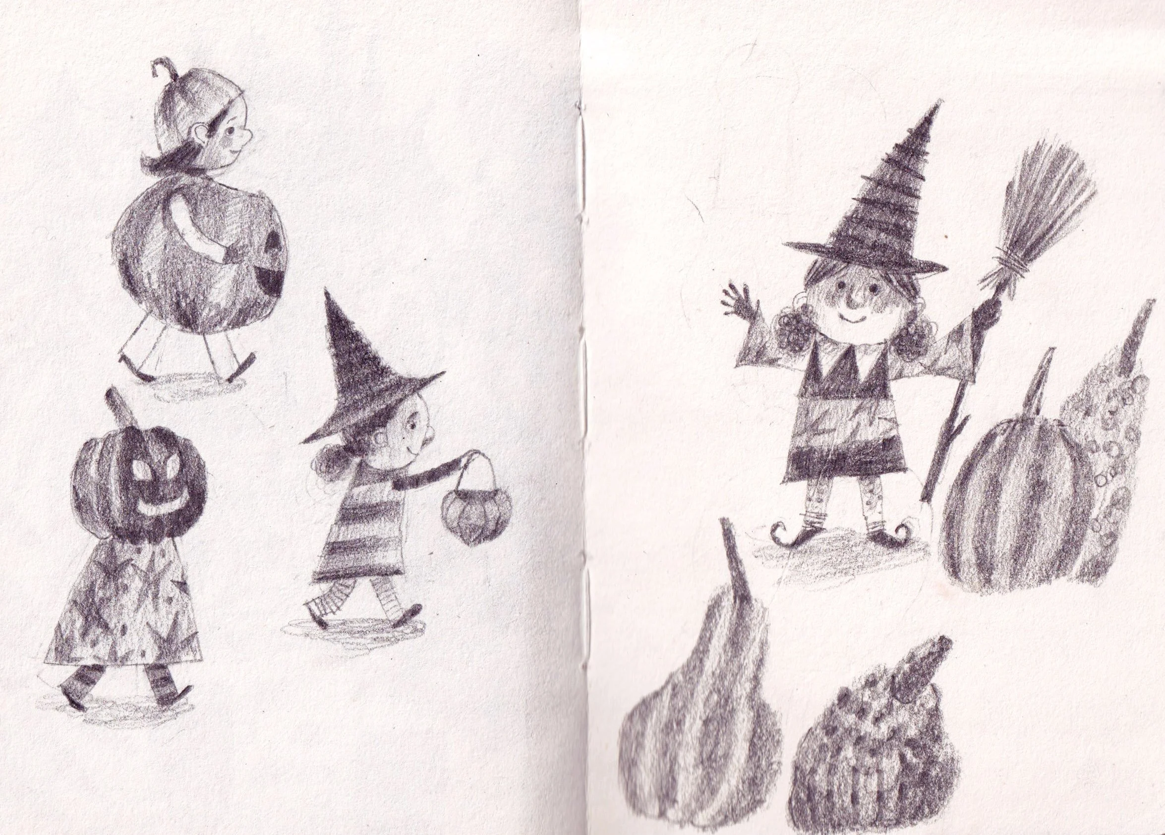
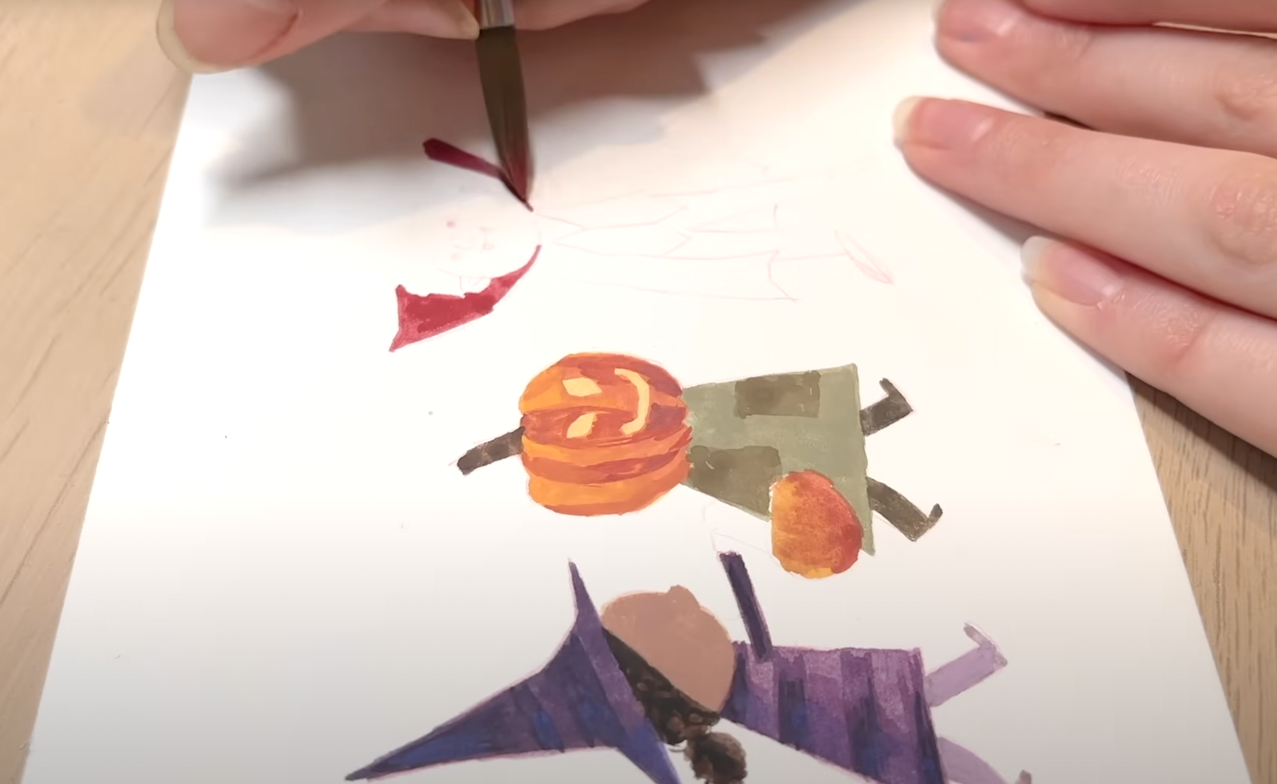
Time to paint the characters! As per usual, I planned out the colours first and painted them almost entirely using watercolour, with gouache and a few acrylic paint pens for final touches.


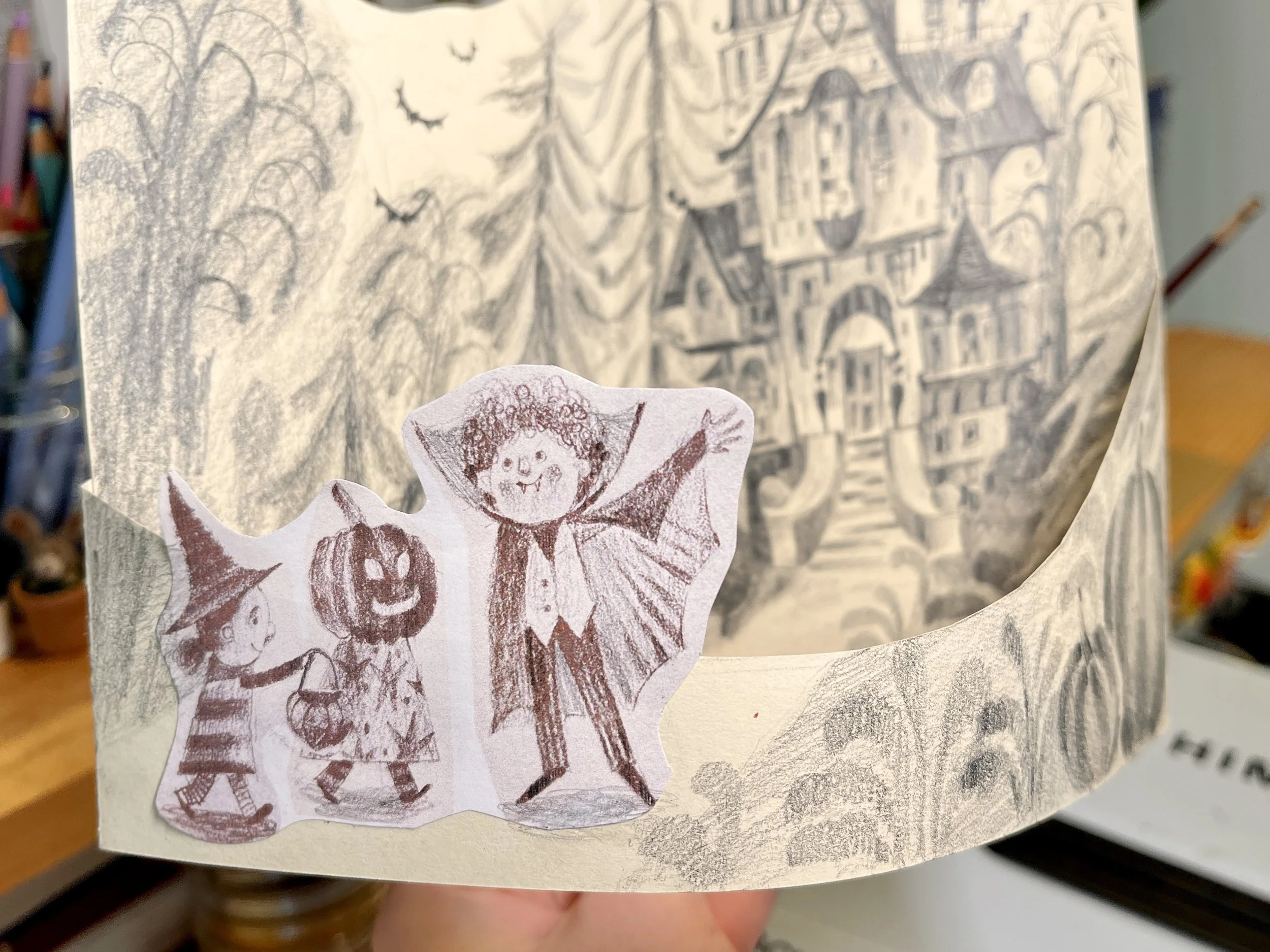
I also had to paint the front section of the scene, which came together really easily as I was just extending the art I had already figured out how to make. Then with a bit of photoshop work, I was able to edit the kids into place and format the images to the right scale, so when you print them out you can glue the front pice to the back and have an adorable halloween decoration!